Studio.byYSR
An Integrated Creative Studio. Founded by a lady from Bangkok.
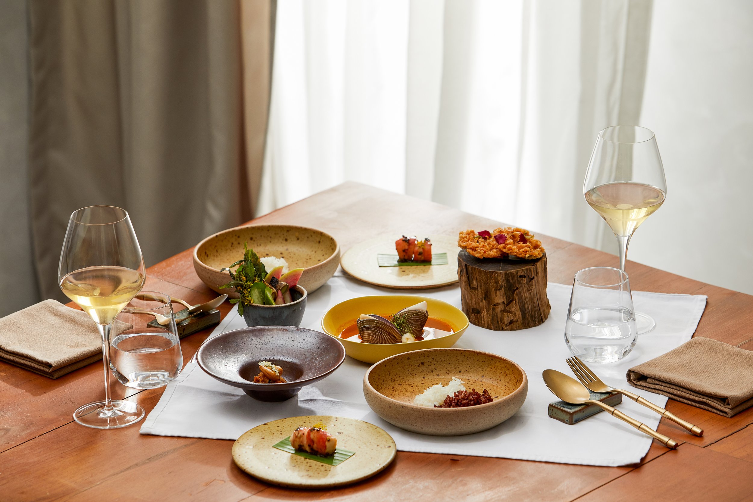
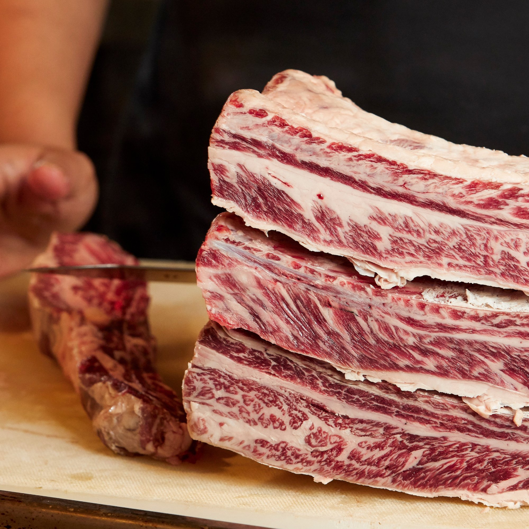
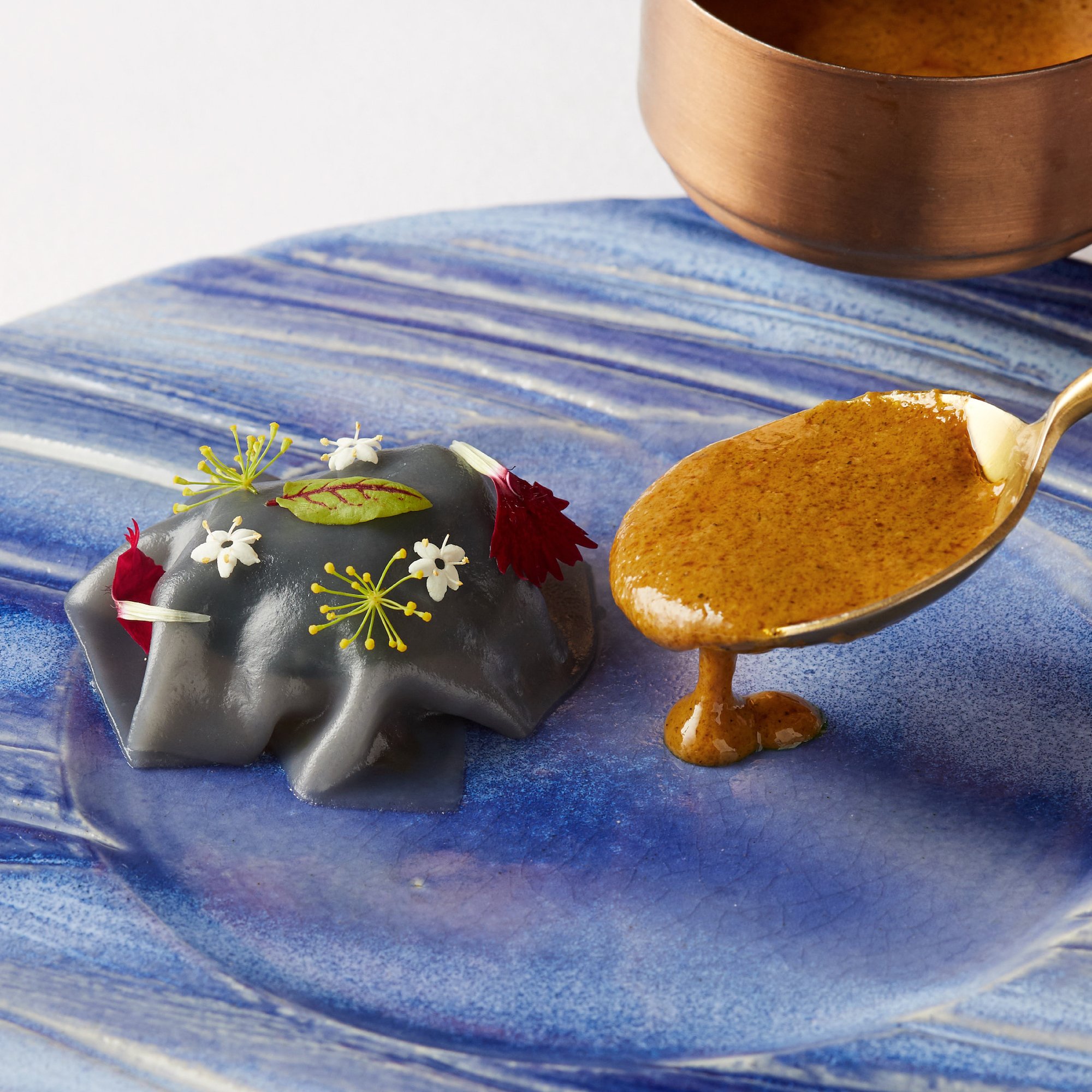
ADHOC is not just a restaurant, it's a celebration of Thai culture, a salute to its rich traditions, and an ode to the earth's bounties. Its ethos is deeply rooted in the 'Farm-to-Fork-Fare' concept, promoting the consumption of locally sourced and freshly harvested ingredients. The culinary art that emerges from ADHOC’s kitchen is not only a feast for the taste buds but also a visual spectacle, meticulously plated with an attention to detail that pays homage to the inherent beauty of Thai cuisine.
In creating the brand logo, we've sought to express this rich narrative. The unique logotype uses the letters 'A' and 'H' as the central motif, drawing inspiration from the intricate details found in Thai architecture. These letters serve as a symbolic representation of the brand’s cultural heritage while acting as a nod to its innovative approach to Thai fine dining.
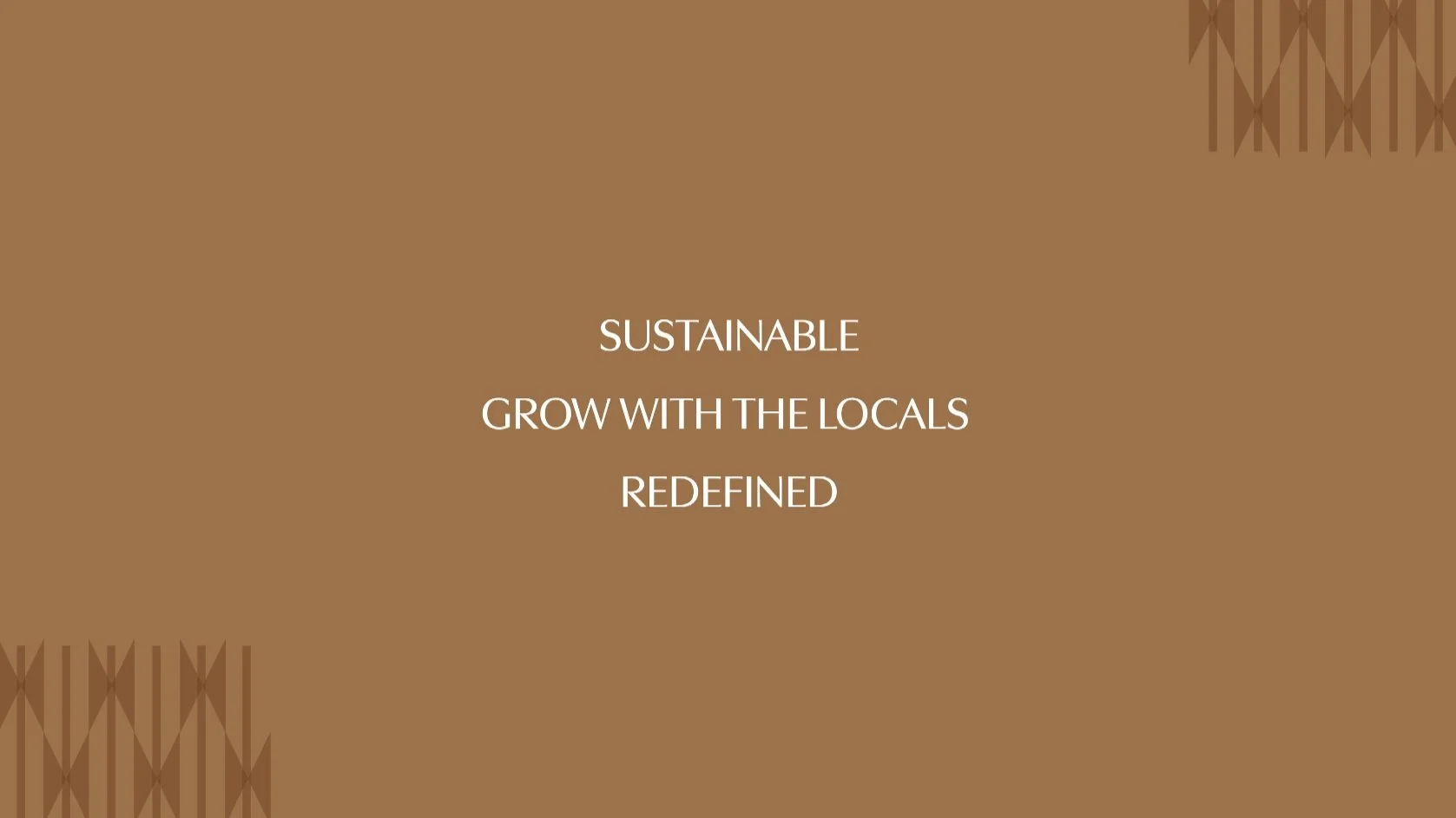
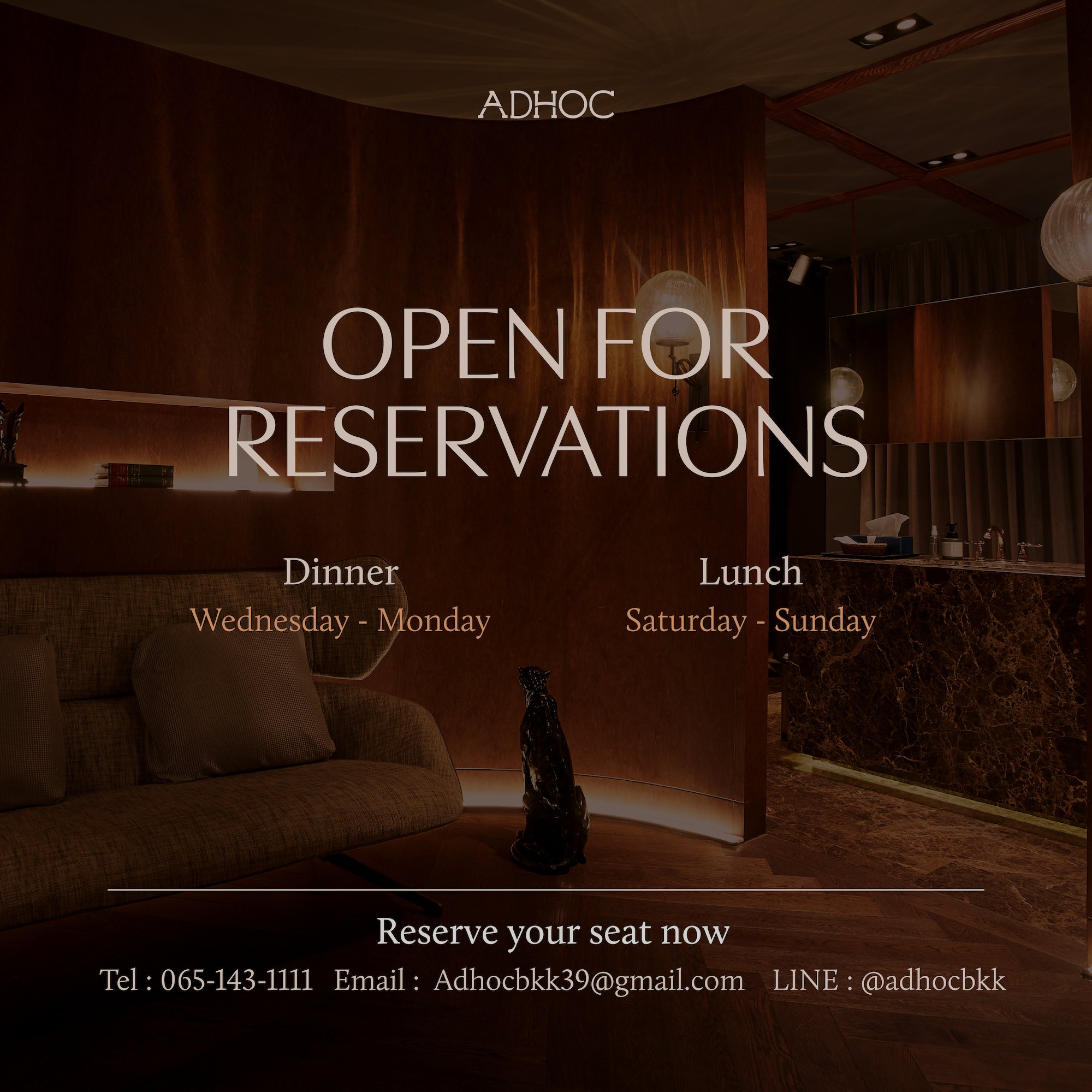
The color palette is designed to evoke a sense of calm, choosing earthy tones that reflect the sustainable ethos of ADHOC. It also alludes to the restaurant's commitment to grow alongside its local community, thereby strengthening the ties between land and table. These colors, reminiscent of wood and earth, underscore the harmonious relationship between ADHOC's culinary practices and nature, promoting an ambiance of organic luxury and elegance.
ADHOC, as a brand, is poised to redefine the fine dining experience, casting it in a light that celebrates sustainability, authenticity, and local growth. The design elements work together in unison to convey this narrative and create an immersive brand experience, ensuring that ADHOC stands as a beacon of modern Thai cuisine that cherishes its roots while innovatively progressing towards the future. The ethos, the aesthetics, and the ambiance all harmonize together, reflecting the heart of ADHOC - an authentic, sustainable Thai culinary journey that truly nurtures the soul.
