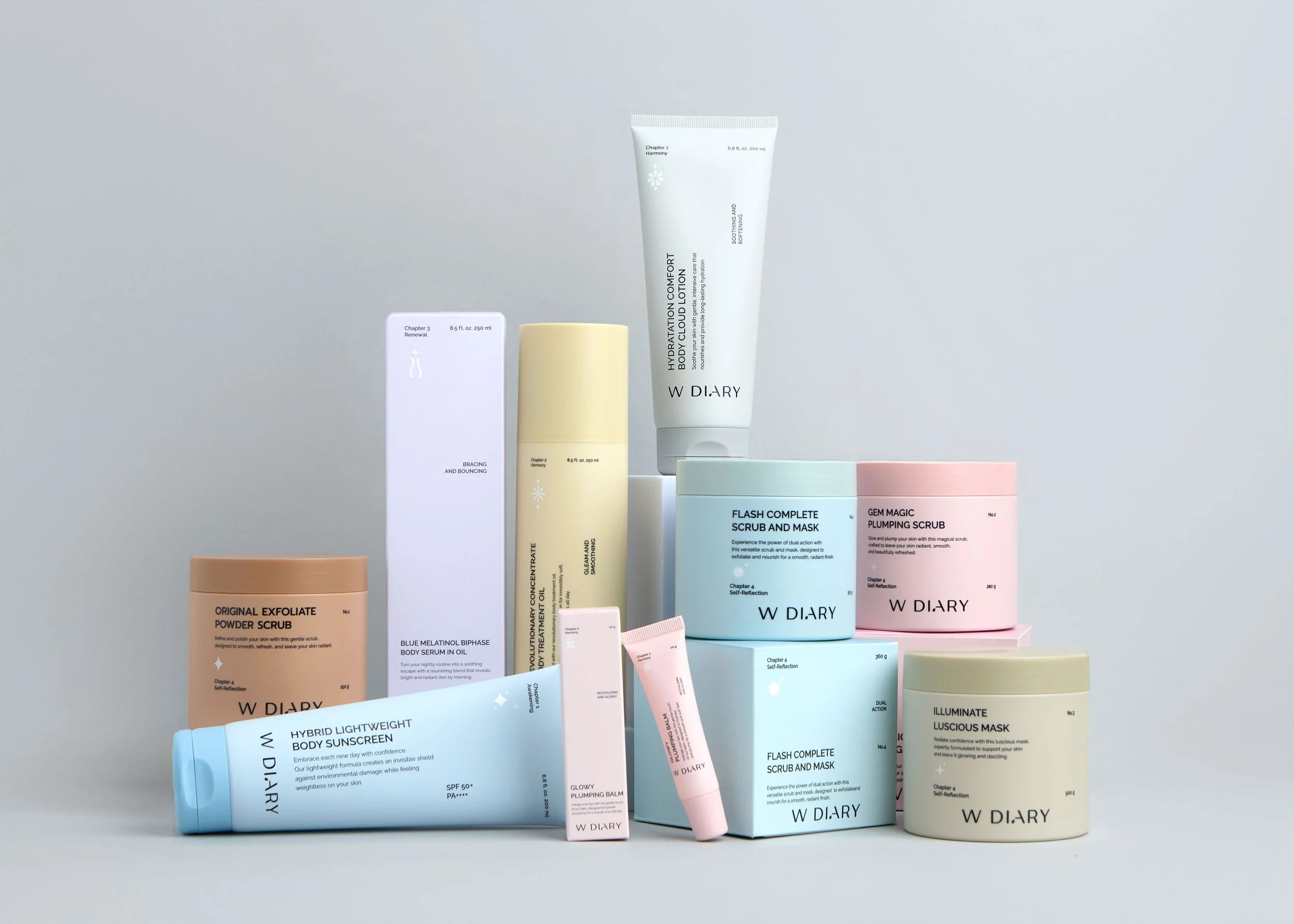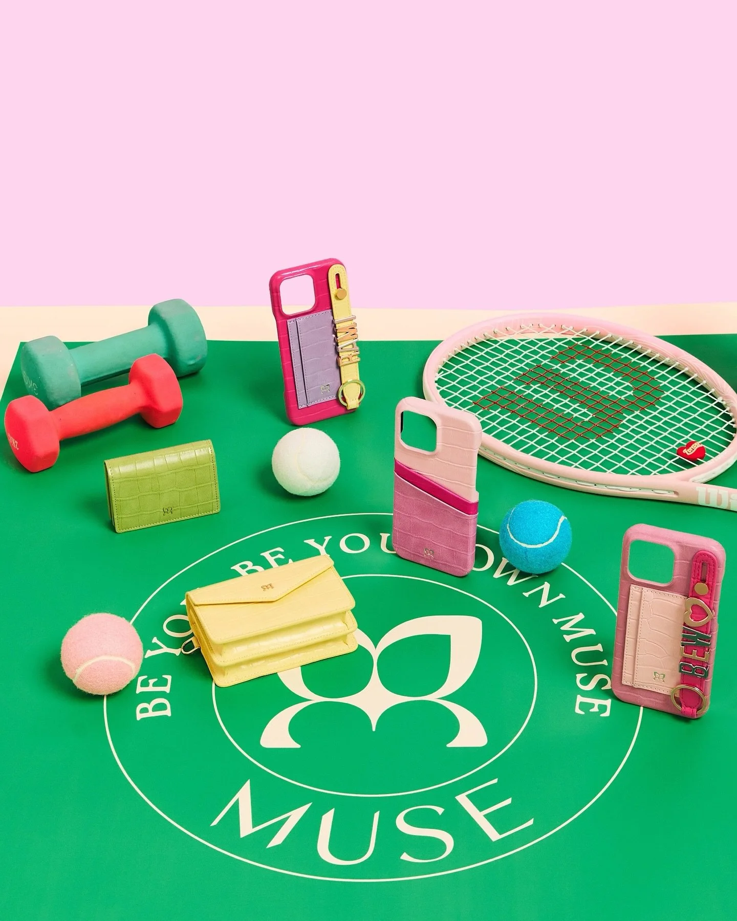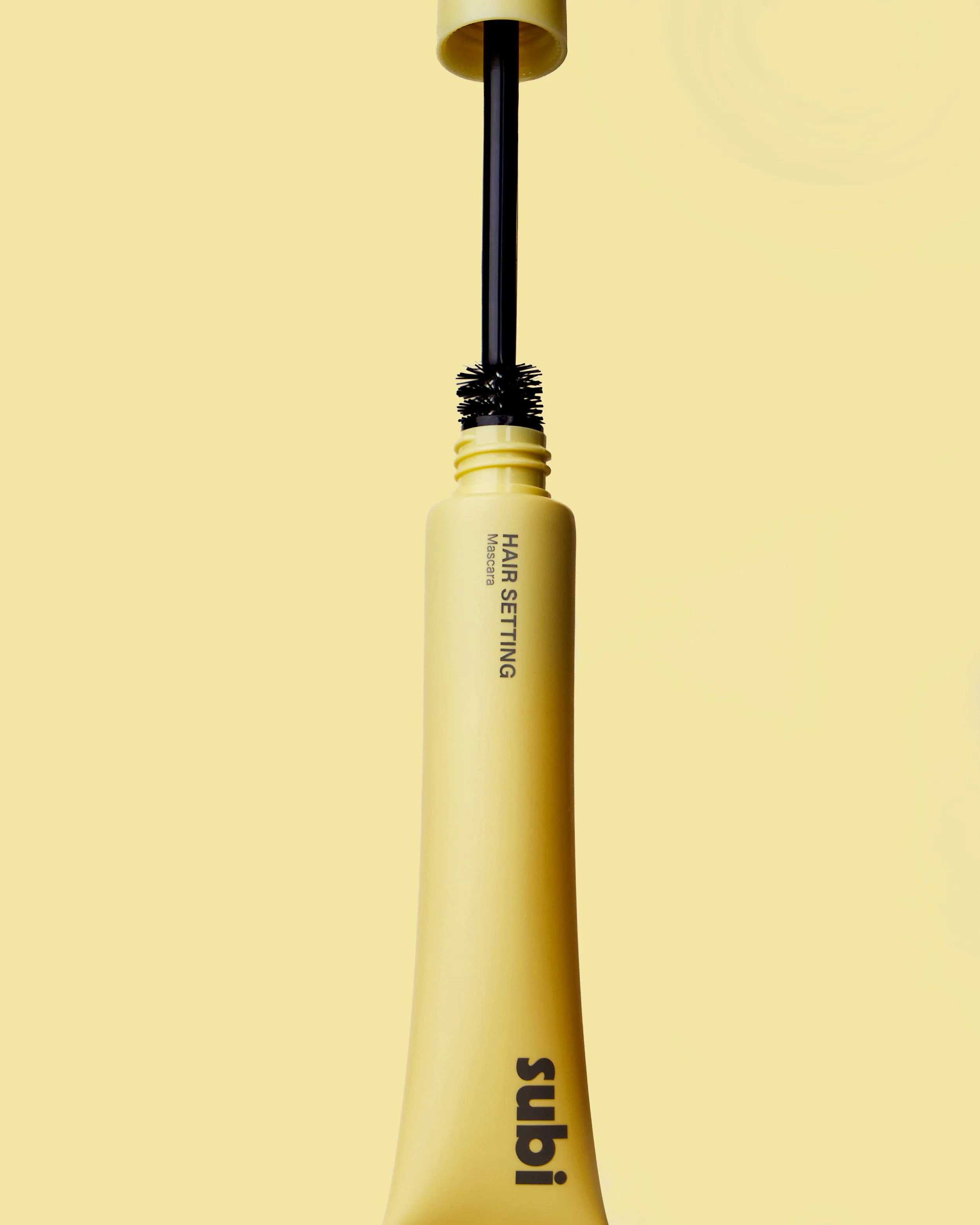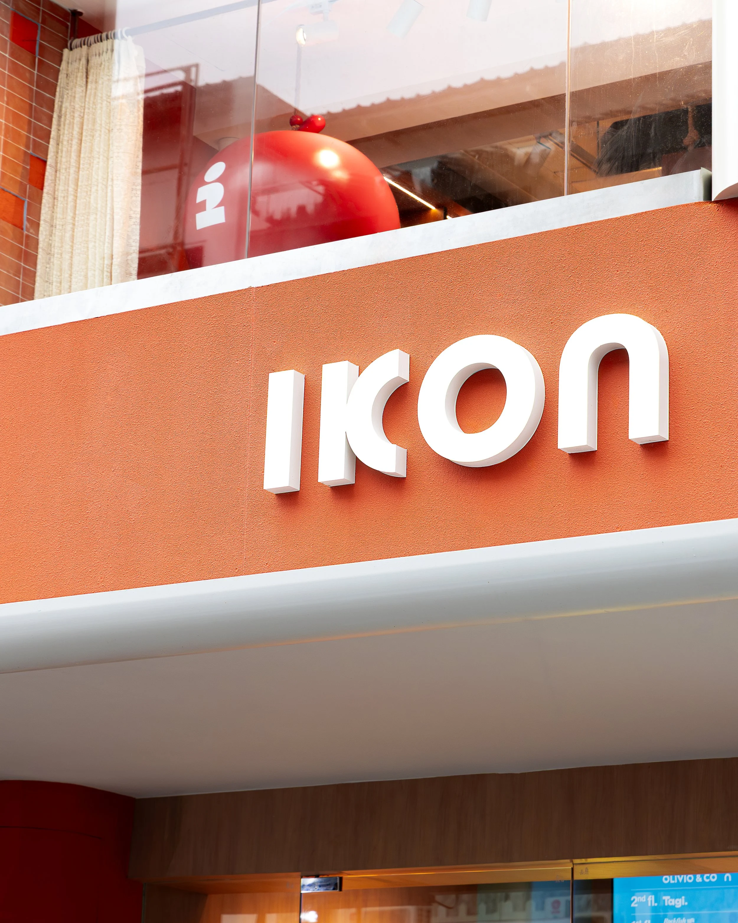
For Grand Cos Group, we crafted a modern, minimalist brand that reflects their values of professionalism, openness, and innovation.
The logo’s sleek design, refined colors, and bold typography create a confident and approachable look.
Our visuals capture beauty, science, and human connection, positioning them as a premium, trusted brand in the beauty industry.
N365, a skincare brand that champions everyday natural beauty and transparency in its products. In line with the brand's ethos, we developed a clean and minimalist logo that conveys the essence of simplicity and purity. For their packaging design, we created a series of visually striking and distinct labels for three unique serums: Glow in yellow, Acne in green, and Deep Hydration in blue. Each color choice is purposeful and represents the specific benefits of each serum, while the overall design highlights the cleanliness and integrity at the core of the brand's philosophy. Our collaboration with N365 has resulted in an elegant, cohesive, and transparent visual identity that resonates with consumers seeking authentic and effective skincare solutions.
In our collaboration with Thai Coco, we designed packaging for three distinct products: organic condensed milk made from coconut milk, organic condensed milk made from oat milk, and coconut whipping cream.
Our approach to the packaging design involved creating unique illustrations for each product, depicting the respective farming stories of coconuts and oats. These friendly and engaging visuals not only reflect the product contents, but also bring to life the story behind their origins. Through our artwork, we aim to forge a connection between consumers and the agricultural narrative, celebrating the natural roots of these wholesome ingredients.
Shependence, a brand specializing in everyday jewelry for the modern woman with a timeless and classic taste. Our design approach aimed to reflect the essence of stylish and contemporary women, with a nod to the elegance of classic fashion. The selected fonts contribute to this aesthetic, lending a fashionable and chic feel to the overall visual identity. Through this comprehensive rebranding, we have created a cohesive and captivating brand experience that resonates with Shependence's target audience and captures the spirit of modern sophistication.
Montagé, a premium salt brand inspired by Southeast Asian tastes, was established by two foreign travellers in Bangkok.
We have collaborated since the start and Studio.byYSR was involved with naming, packaging design, stationery design, photo guideline and more.
Visit www.montagesalt.com and experience the brand yourself.
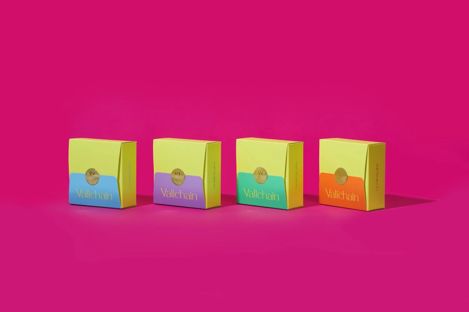
Valichain, a vivid bling-bling jewelry brand designed by VValentines, a charismatic beauty blogger. With her strong passion for the perfect combination of playful-vibrant colors and glamorous glit accessories, VValentines intends to make her eye-catching jewelry brand image unique from others.
After we have discussed and planned with VValentine, we conclusively agreed that the direction of the brand will aim to express herself and her preference in terms of confidence, chic, and sophistication in the forms of bright colors, timeless designs, and versatility of the jewelry.
The neon yellow-green color is the hero color of the brand. It represents the fun, uniqueness, and joyfulness of the brand essence. With more vibrant and various tones of the color, it gives the sense of prominence to the brand even more. Also, the overall vibe will be featured in a chic and modish style and will be represented in film-style photoshoots and sexy-colorful product shooting with revealing the radiant skin of the models.
我們協助 CLOS 呈現一個無性別、無國界、無限制的品牌形象。好的品牌形象可以讓你在競爭激烈的市場脫穎而出!
CLOS 品牌的初衷是希望創造出一個既可以「時尚」又能「防疫」的產品。CLOS 既是時髦百搭的飾品,也是抵禦病菌、淨化空氣的幫手,只要戴上 CLOS 就能享受大口呼吸新鮮空氣的快感,讓你在這個疫情新常態活得更加舒適及安心!
CLOS, A Taiwanese Brand
Fundao is a thoughtful yet charming brand that utilize organic materials with the goal of drawing the natural work closer to women’s lives. The strap is made out of 100% real pearls from Phuket, the southern sea of Thailand.
Scope of work: logo design, brand concept, character and philosophy. Packaging, Color guide, photography guide and social media contents.
Up and Under, a leading bra and underwear brand.
We have reimagined their brand identity, reflecting their commitment to self-confidence and comfortable, high-quality lingerie.
Our team refined the logo for a more modern aesthetic, made red their primary color to emphasize femininity and passion, and designed new sleek, minimalist packaging that showcases the brand's commitment to quality.
The result is a cohesive, iconic, and feminine brand experience that aligns with the values of Up and Under and resonates with their target audience.
We created a brand identity along with the logo, a series of fun illustration, packaging and t-shirt design for Sentimental Store. Sentimental store is an energetic bright clothing store, a brand that inspired people to have fun while dressing up! x
Because healthy doesn’t have to be boring✨😌
The logo is inspired by the experience of baking and a combination of the ingredients of the baked goods. We filled the white space in the i, a, e to the shape of rolled oats for a touch of a 💫.
Logo and Packaging Design for Sentimental Baking Club
VISIT LINK
GBDi, Government Big Data Institute of Thailand is a platform where Thai government share, analyzed data.
Identity, Digital, Print,
Sujittra was founded on the basis of supplying customers with the best gemstones we can find. It all starts when Ms. Sujittra traveled to the countryside of Thailand and brought back beautiful gems such as the Burmese rubies, royal blue sapphire, and jades in the 1980.
Today, we still thrive to select the best diamonds and colored stones in the market and incorporating graceful and innovative designs to exceed your expectations. Our core value is integrity and that is why each gemstone in our store comes certified from reputable gemological laboratories. We believe that our customers' satisfaction is our number one priority.
A Book highlighting about Volkswagen Caravelle features and personalised information. Each page is designed to tell a different story. All images were taken under the Design Direction from our studio.
Photographer: Keith Scope
For the Creative Brochure for List Sotheby’s, we created a brochure that cut and fold out like the shape of a building.
A newly launch ready-to-wear jeans that is made for all women. Founded in Bangkok by two close friends. FAD aims to create high quality and stylish jeans.
FAD comes in various sizes, color and style. It is made to be inclusive of every women no matter their skin tone, their taste or their sizes.
Branding and Web design for A Pale Petal, a Thai designer label that is known for its line of signature pleated bags. It is made for the aesthetic admirer who appreciates simplicity and functionality in design.
Visit: www.apalepetal.co
Sasin Startup Incubator: Impact Ventures (or SSI: Impact Ventures) is the expert player in the startup ecosystem, specifically as incubators and trainers.
SSI’s main “customers” are Startups or Entrepreneurs (or aspiring entrepreneurs), with the focus on Social Enterprises - businesses that want to make an impact on the world, socially and/or environmentally. The Secondary “customers” are investors and ecosystem builders such as Government agencies, corporate, and other universities related to startup space.
Shout out to Nonpareille, Kamolnut Boonsert and Phunnphat Watleela
Featured in Fonts In Use
Branding for So Craft Industry, a manufacturer and exporter of handmade products in Thailand, producing mainly shoes and 10% bags.
The core business value of So Craft is to create innovation crafts that focus on high quality with good design and excellent service for the customer.
Design application includes business card, envelope, letter head, price tag and uniforms.
Femme Studio was started by 3 friends with the same interests and style. The brand’s core value is to empower women. Femme Studio aims to create products that allow wearers to easily match with the outfit. With the target audience at the age of 21-35, the brand’s design aesthetic is to pioneer a style for women who prefer the gender neutral / boyish look.
Pfizer internal Project Bilingual animation
The goal is to create an easy to understand animation that matches the script provided for the internal stuff to have a positive overview about Project Arrow.
English Voiceover by Jerome Chen
Thai Voiceover by Akkaraphol Yanachai Chommouk
Heath Ceramics is an American company that designs, manufactures, and retails goods for tabletop and home, and is best known for handcrafted ceramic tableware and architectural tile in distinctive glazes.
Scope: Supplement photos of actual paint colors in use, referencing the cans and bottles in hand as well as matching each paint with Pantone color. A work in 2015.
Branding Design Direction, E-commerce Design
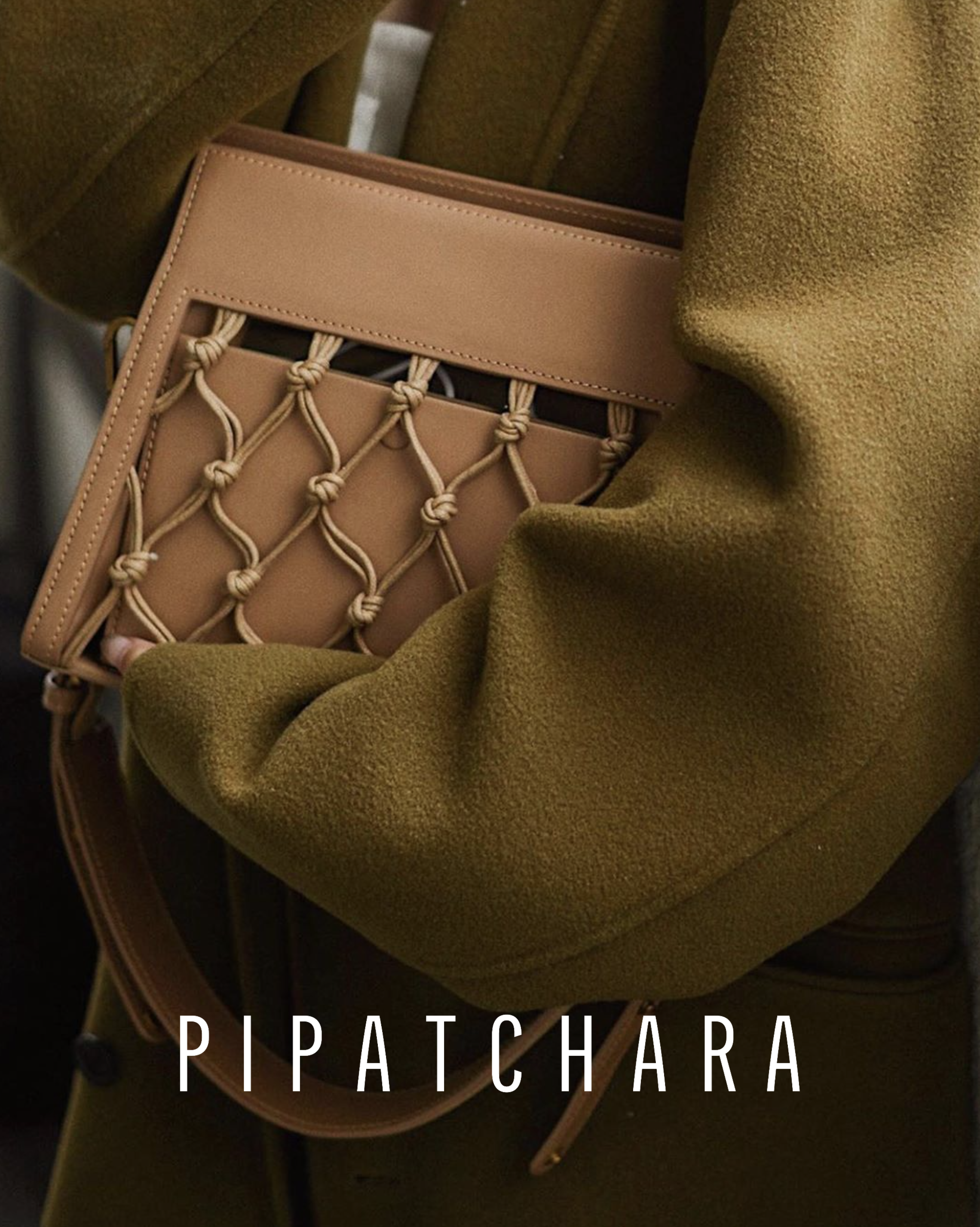
PIPATCHARA’s 2018 collection is a collaboration between Pipatchara and her sister – Jittrinee. Both have strong passion in Arts and Crafts, especially the technique of "Macramé". This debut is an example of integrating tradition with contemporary design. Such patterns require 100% hand-made work. Each bag delicately made to exhibit the unique of the hand-weaving pattern, pairing with the well-selected quality leather to showcase the unique combination.
The core of the brand is that the product focuses on the workmanship, community, and quality.
Follow https://www.instagram.com/pipatchara/ or visit www.pipatchara.com
Press-kit for PalmCoolers
Our creative folds presskit for Palm Coolers. PalmCooler is releasing their new model in 2018. It now keeps ice lasting up to 7days, Tougher, Built and design to last forever. The brand visual focuses on the high-quality photography, bold sans-serif typeface with catchy headlines and the product itself.
After visiting Makai's cafe, knowing more about the story behind Makai's brand, which was inspired and started in Hawaii. We choose to refine the logo to be sharper while still keeping the brush texture, the original idea of the waves by the beach. Applying it to the high-quality lifestyle photography and others graphic design elements, we aim to create a flexible system which will work responsively in all layout for social media, digital marketing, and print application.
By selecting a handwritten surf style typeface pairing with a clear condense all-caps type, we hope to make Makai brand feels both easy going, yet sophisticated like how a person would feel when they are by the beach!
View full presentation of the store front: HERE
People give up privacy for attention and admiration. Graphic Design Thesis 2015 at California College of the Arts.
Code Advisor Thanabordi Jianrungsang and Ben Vibhagool
Featured in The Creator's Project
Best of 2015 in Art Selfies
The purpose of this campaign is to send positive messages to people all around the world. The goal is to bring happiness through exchanging anonymous messages and pictures at unexpected times and places.
A mixed media conceptual installation that explores the modern society, how people present themselves as being aware, accomplished, sophisticated, but underneath the surface, they are lost, broken and empty.
Exhibition : Baccalaureate Exhibition 2015
An infographic map that compares the rent prices in SF to private bus stop from SF to Silicon Valley.
Featured in The Bold Italic, Fonts In Use, Kreative Feed
Visual identity for Summer Design Intensive 2015 at California College of the Arts. intensive.cca.edu
Featured in Fonts In Use
Young Artist Studio Program Postcard 2014 for California College of the Arts
Hudson Yards Experience Center Brand Book 2015
Hudson Yards is a large-scale redevelopment program planned, funded and constructed in Manhattan New York.
A work under Rockwell Group
“Chaao” comes from the Thai word for “people”. We dedicate this brand to those people who spend their efforts cultivating it and who love eating Chaao rice.
Visit: www.chaaorice.com
象形 • Elera is committed to creating a better living and a better lifestyle with a vision for the future to enhance the next generation's life. The "Elera" brand name was created in the beginning of 2018 and is used as a brand for electronic gadgets. It is a combination of the word "Elephant" and "Era." Elephant, the ever gentle and wise Spirit animal, exemplifies focused power and strength.
Client: Elera Tech, a subsidiary company under 真和集团
Design Director: Yaow Suwanna Ruayrinsaowarot
Designer: Pun Mingkwansuk, Kamolnut Boonsert
Series of typographic experiments by YSR
Sasin Startup Incubator: Impact Ventures (or SSI: Impact Ventures) is the expert player in the startup ecosystem, specifically as incubators and trainers.
SSI’s main “customers” are Startups or Entrepreneurs (or aspiring entrepreneurs), with the focus on Social Enterprises - businesses that want to make an impact on the world, socially and/or environmentally. The Secondary “customers” are investors and ecosystem builders such as Government agencies, corporate, and other universities related to startup space.
Shout out to Nonpareille, Kamolnut Boonsert and Phunnphat Watleela
Featured in Fonts In Use
Works and Projects created in the LAB at Rockwell Group
In today’s fast-paced culture, we are consuming content at a wasteful rate. Tabloid news dominate headlines and leave little room for meaningful stories that have a lifetime impact. Pabulum magazine shines a spotlight on worthwhile lessons that have become ignored in today’s ephemeral, fast paced culture.
Design collaboration with Matt Lew
Featuring a story from Michael Gallagher, a CCA writing major student.