Studio.byYSR
An Integrated Creative Studio. Founded by a lady from Bangkok.
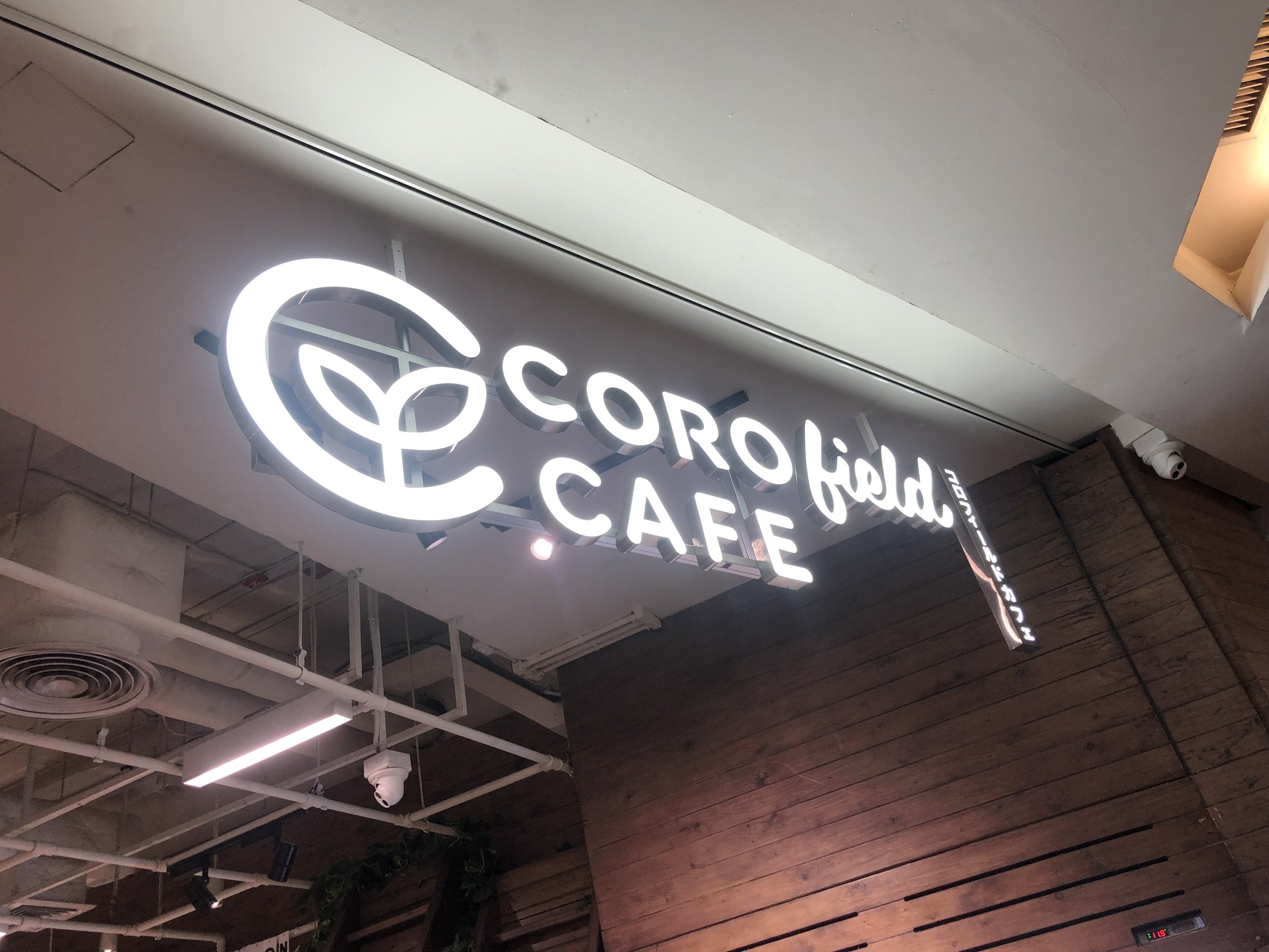
With Corofield’s vision and understanding more about the Brand. We aim to come up with something that would standout from the crowded supermarket at the Gourmet Section of Siam Paragon.
Site Visit
We started by presenting the client with three different design and strategies. The chosen design is inspired by the Japanese farmer’s market. By using the wood texture, ice bucket, and giving names for each section, making signages for customer to navigate easily and find what they want, we hope to attract people who are walking passed the booth.
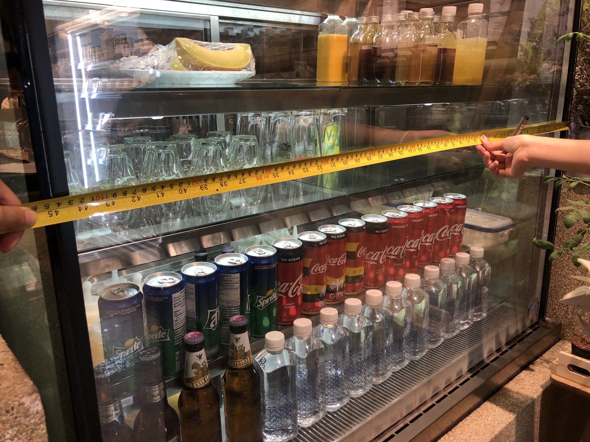


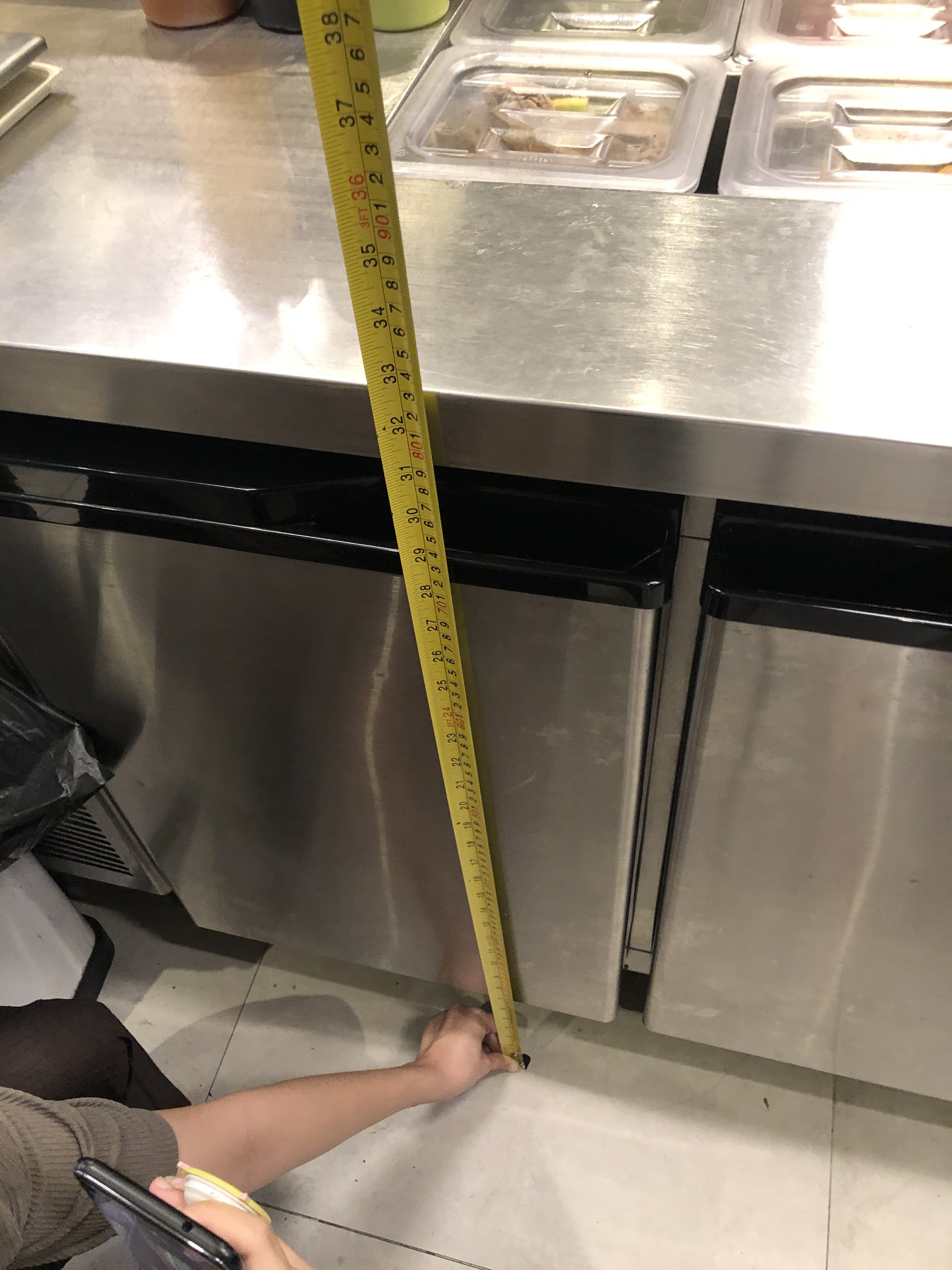

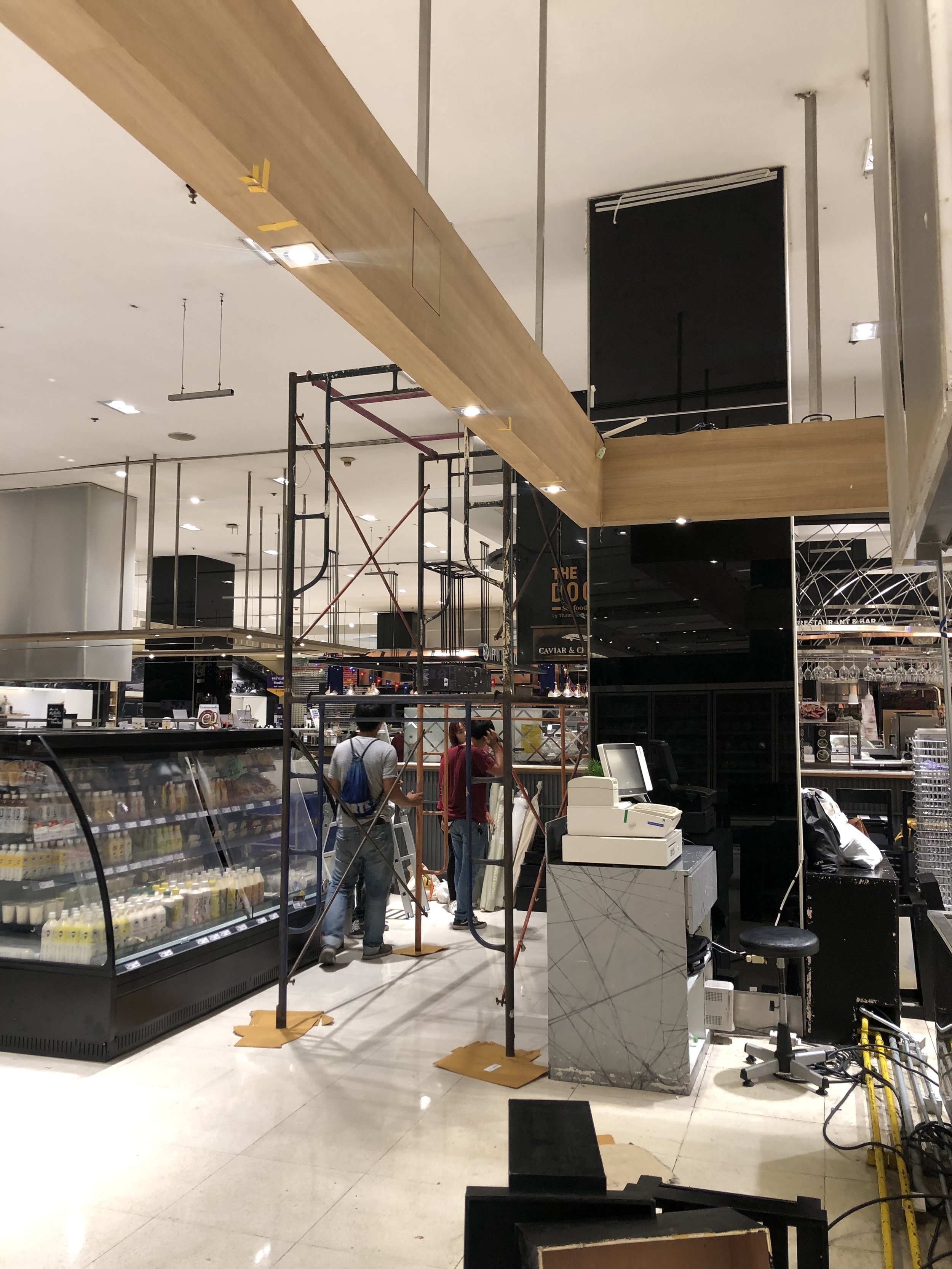
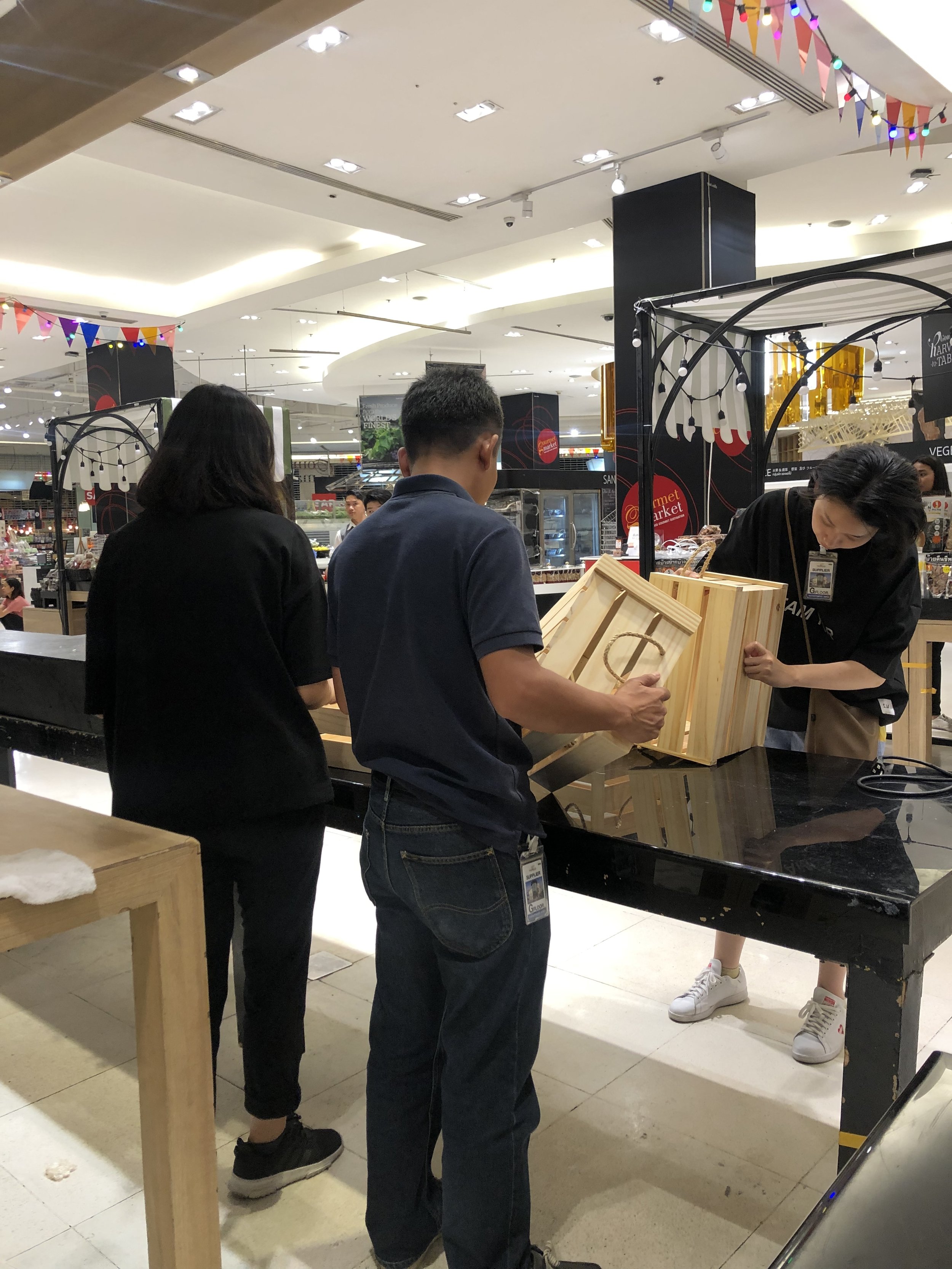
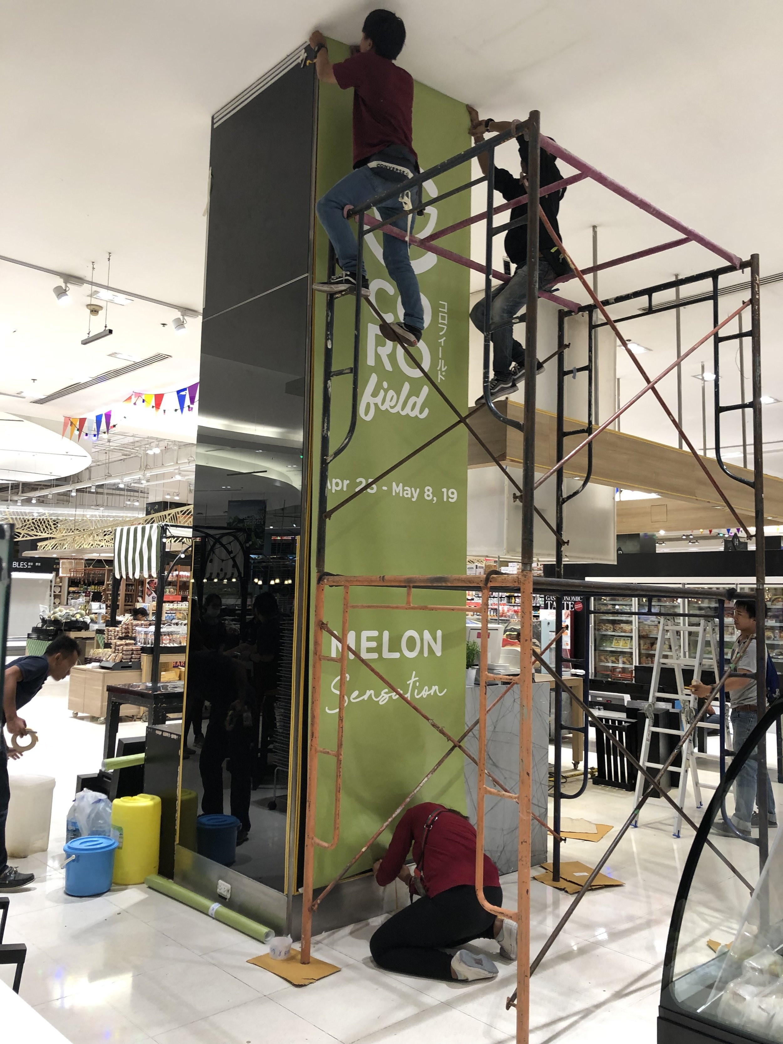
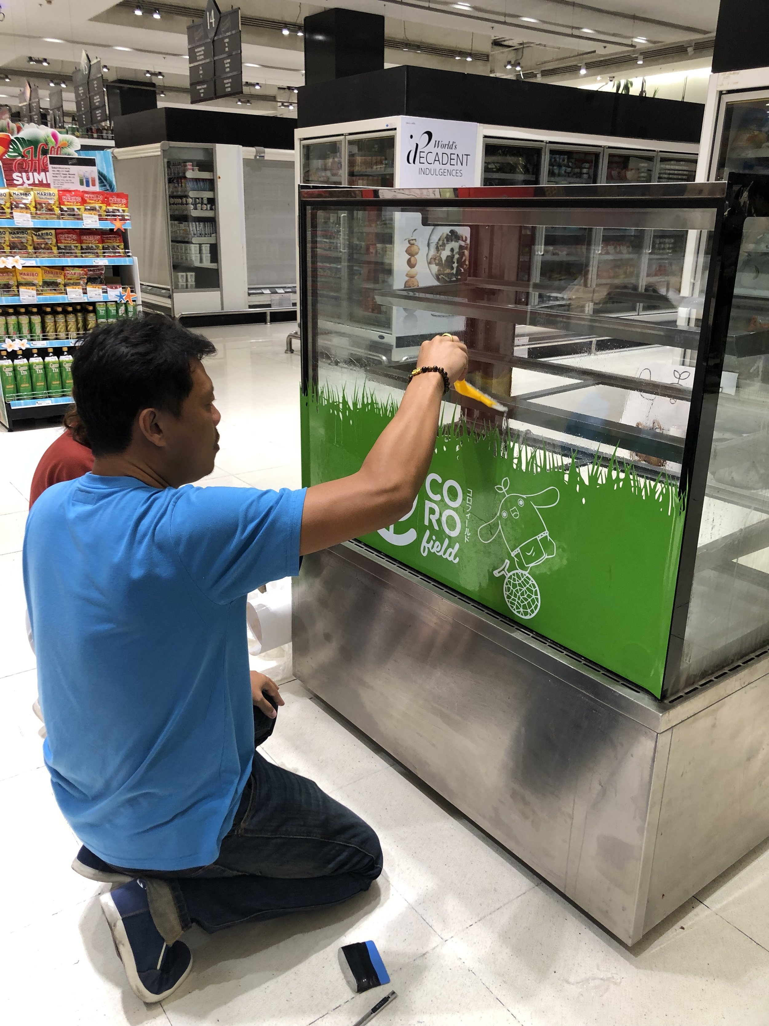
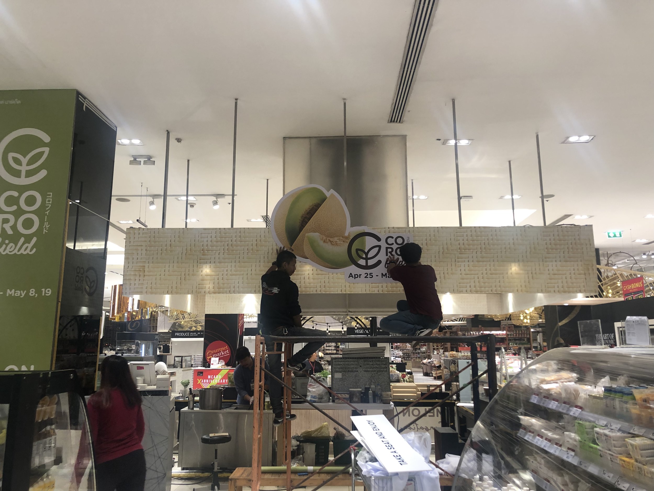
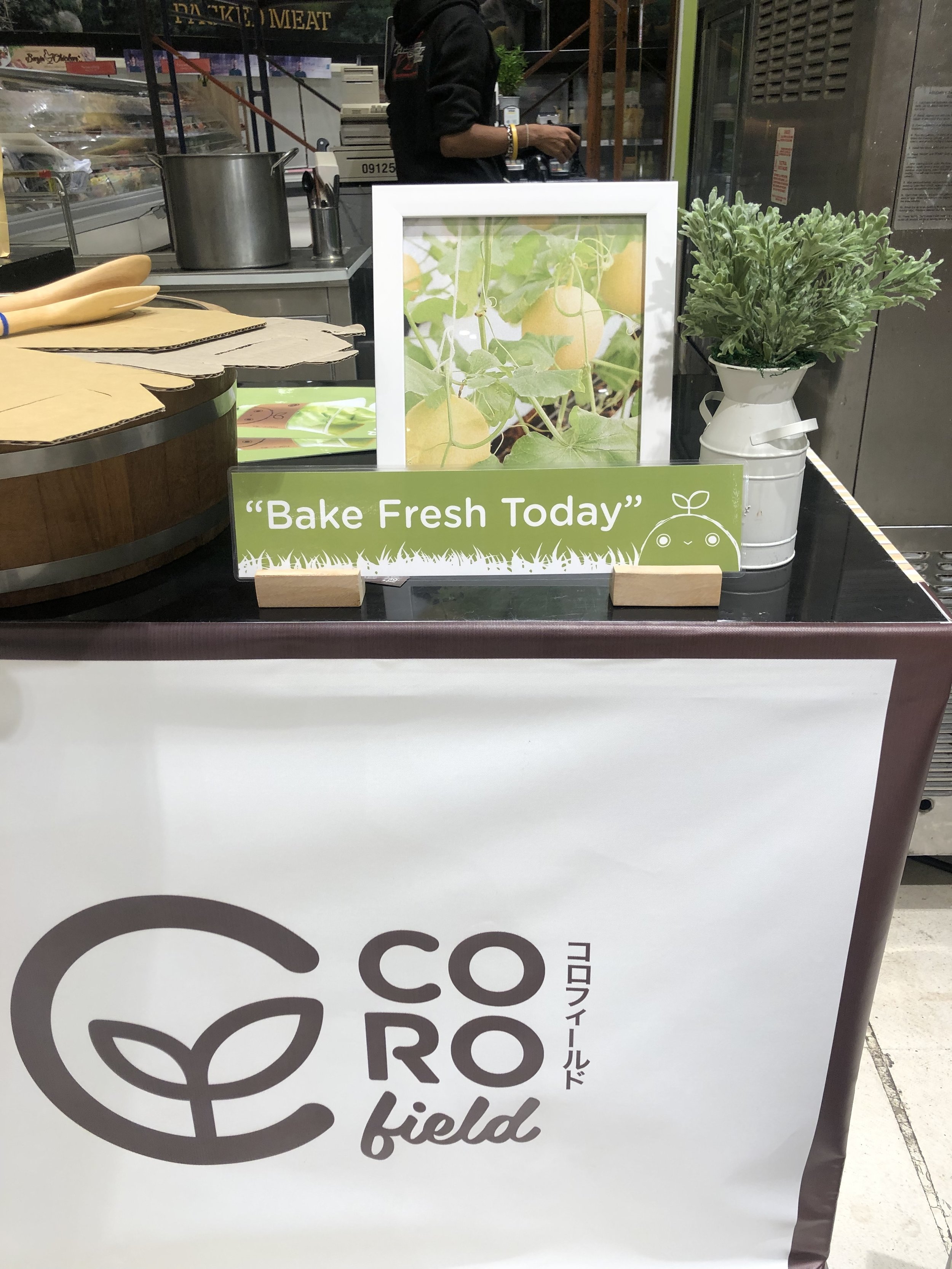
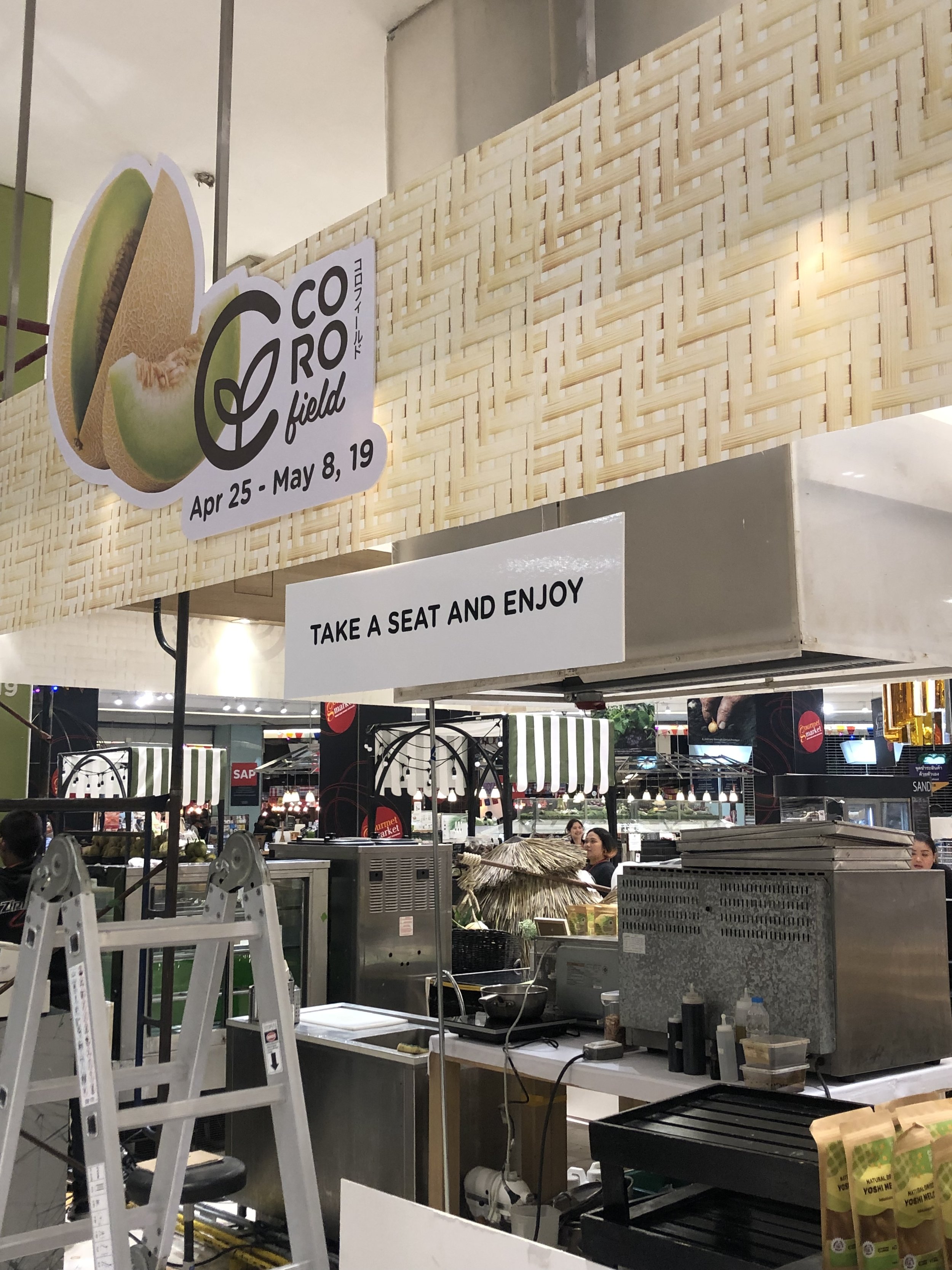
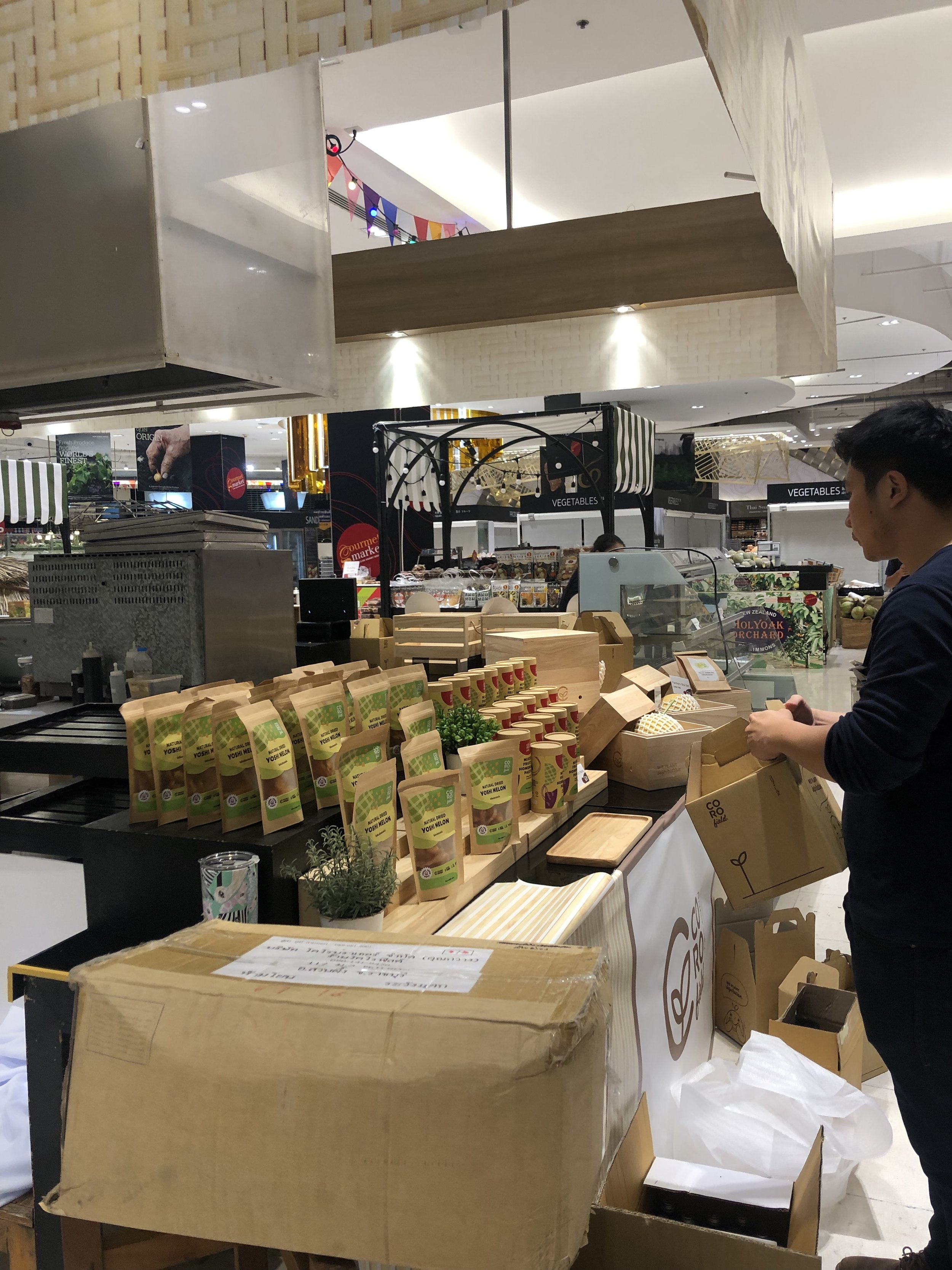
Final Design and Measurements
Graphic Elements
Corofield’s Posters and Label Design


