Studio.byYSR
An Integrated Creative Studio. Founded by a lady from Bangkok.
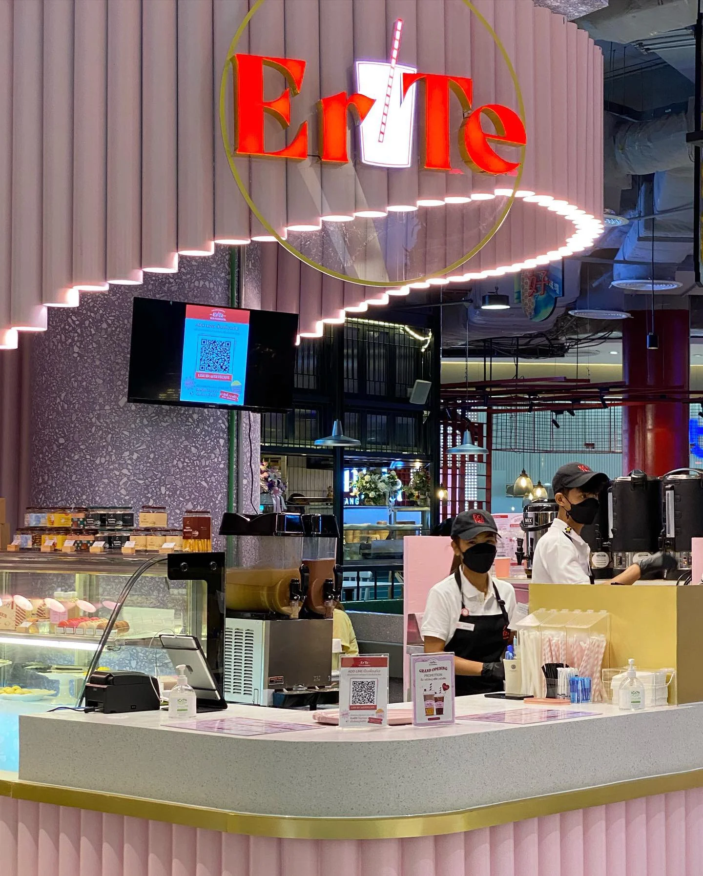
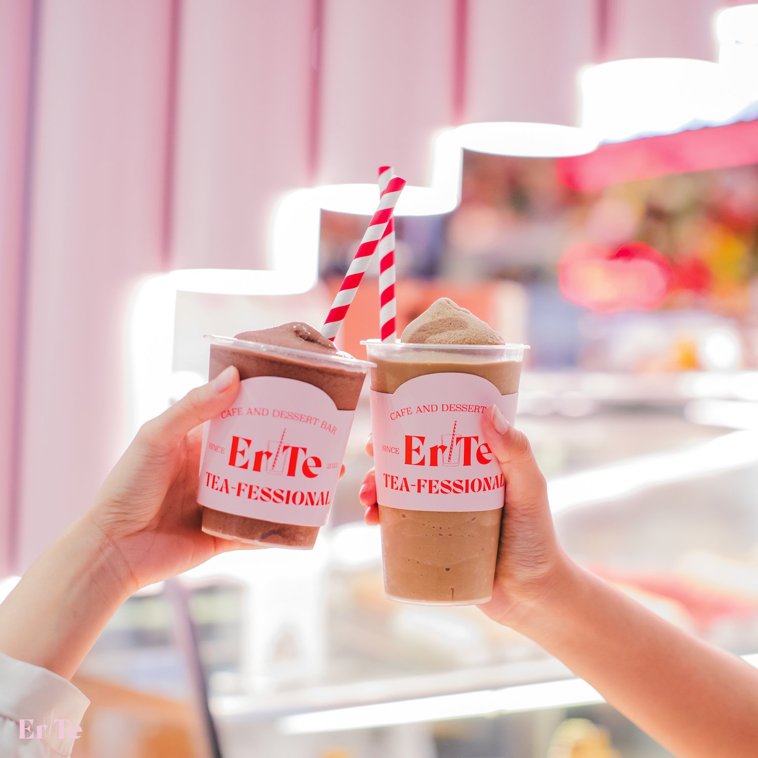
The Er-Te branding project is a comprehensive visual exploration that captures the essence of a modern beverage shop, designed to bring daily sweetness into the lives of its customers. Our primary goal was to create a brand identity that instantly communicates the nature of the business and appeals to its target demographic, predominantly women.
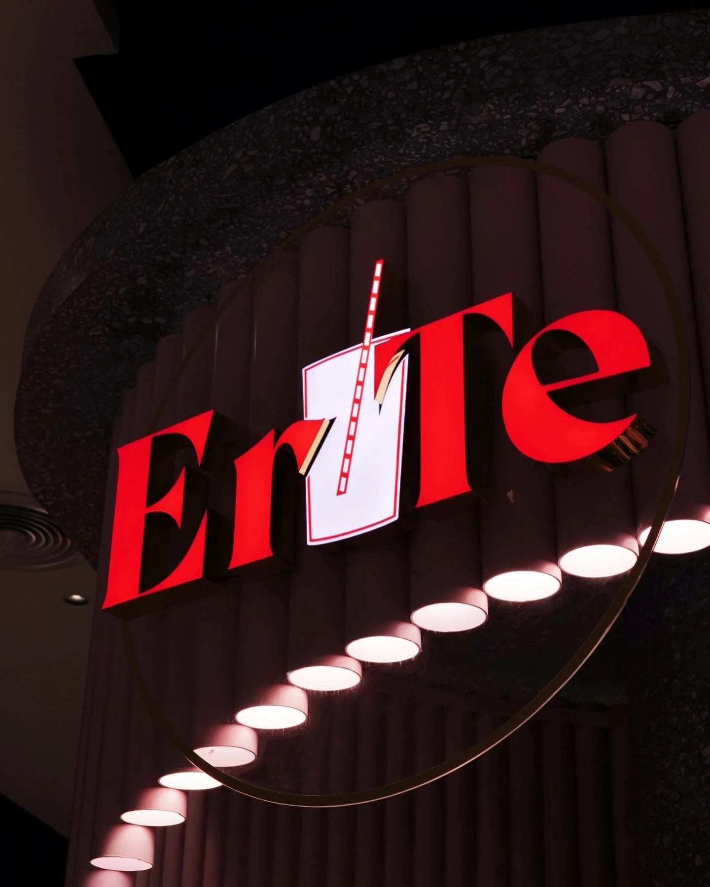
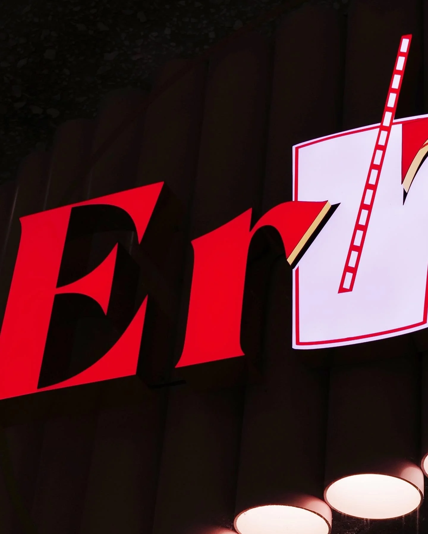
At the heart of the project lies the logo, which features a glass with a straw, a simple yet effective representation of the beverage shop concept. This immediate visual cue allows consumers to recognize the nature of the business at first glance, reinforcing the brand's identity as a provider of refreshing and delightful drinks.
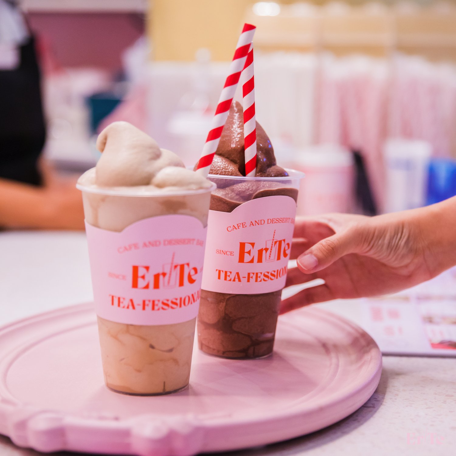
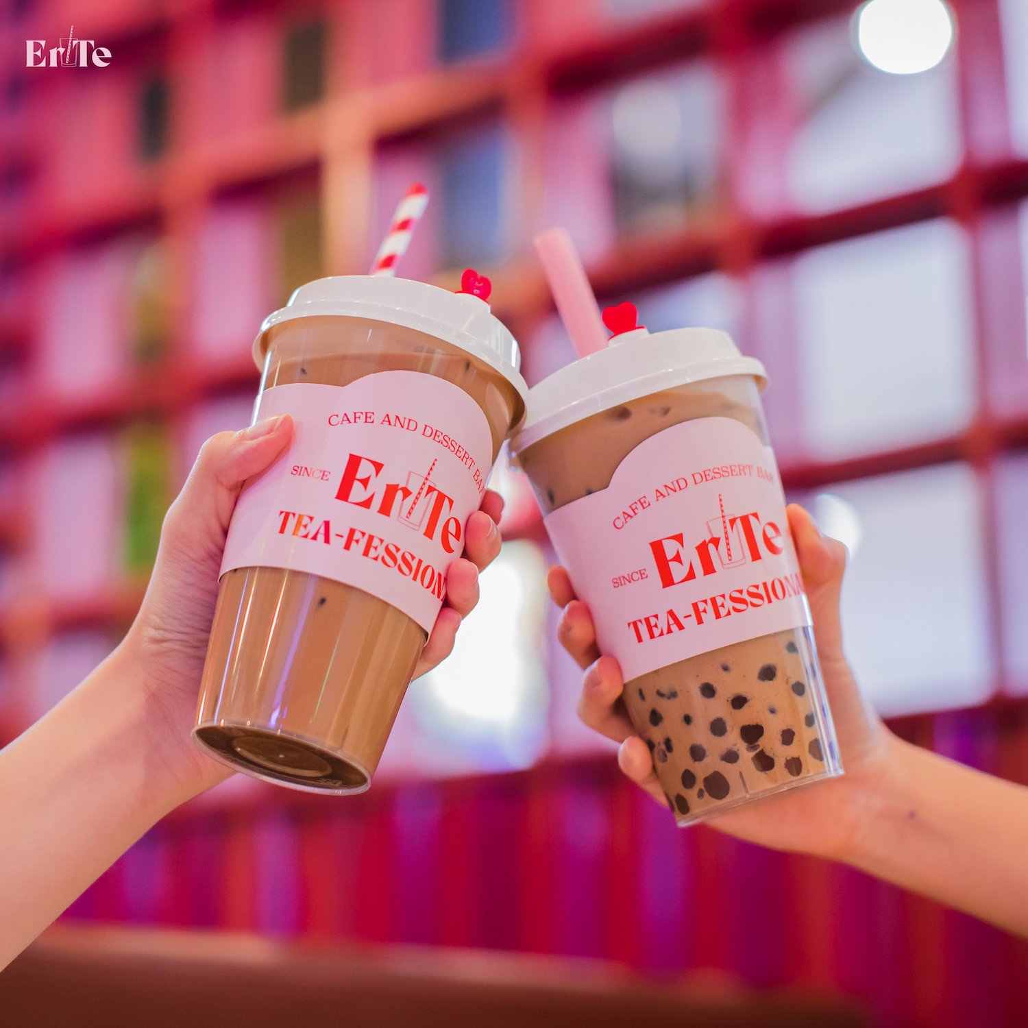
The tagline, "daily sweetness," is strategically positioned above the logo, further emphasizing the brand's commitment to enhancing its customers' everyday experiences with a touch of joy. The playful and innovative term "tea-fessional" is used as a gimmick word, adding a unique and memorable twist to the brand's persona.
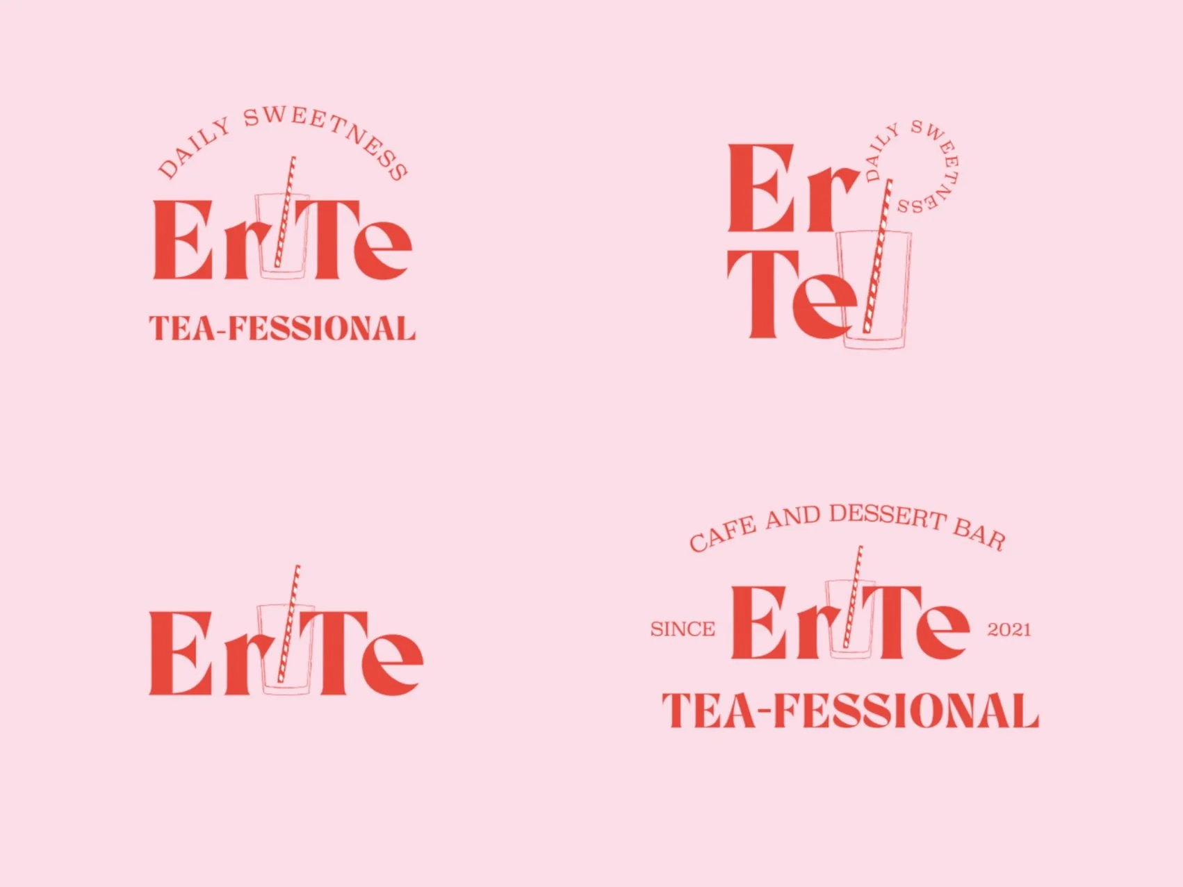
To ensure the brand's visual consistency and versatility, we have designed four distinct logo variations for different situations, including landscape, portrait, and detail-oriented applications. This allows the brand to maintain its strong identity across various platforms and materials.
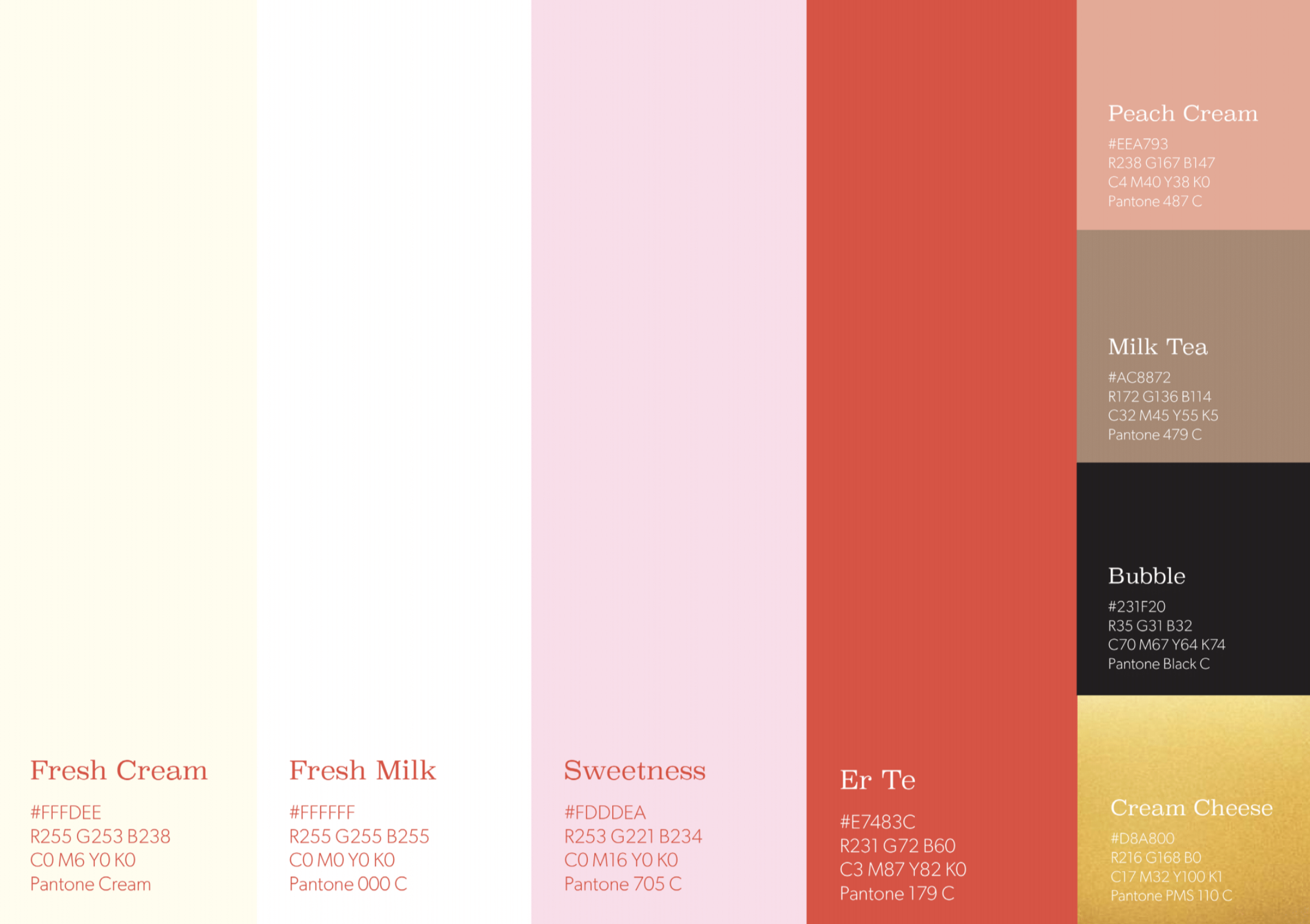
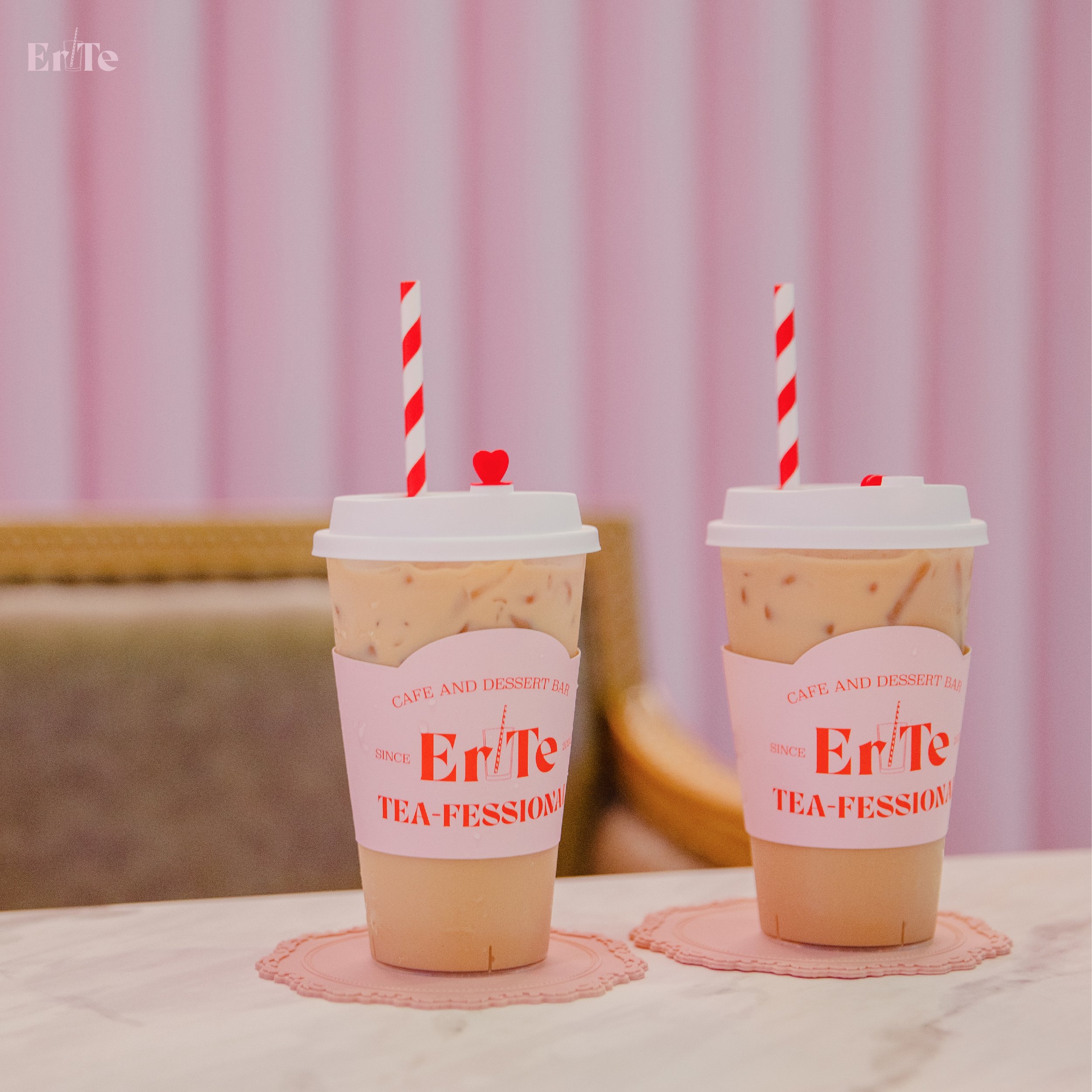
The color palette of pink and red was chosen to create a warm, inviting, and memorable atmosphere, reflecting the brand's focus on providing a pleasant experience to its primarily female audience. These iconic colors not only convey the feelings of love and sweetness but also create a distinctive visual identity for Er-Te.
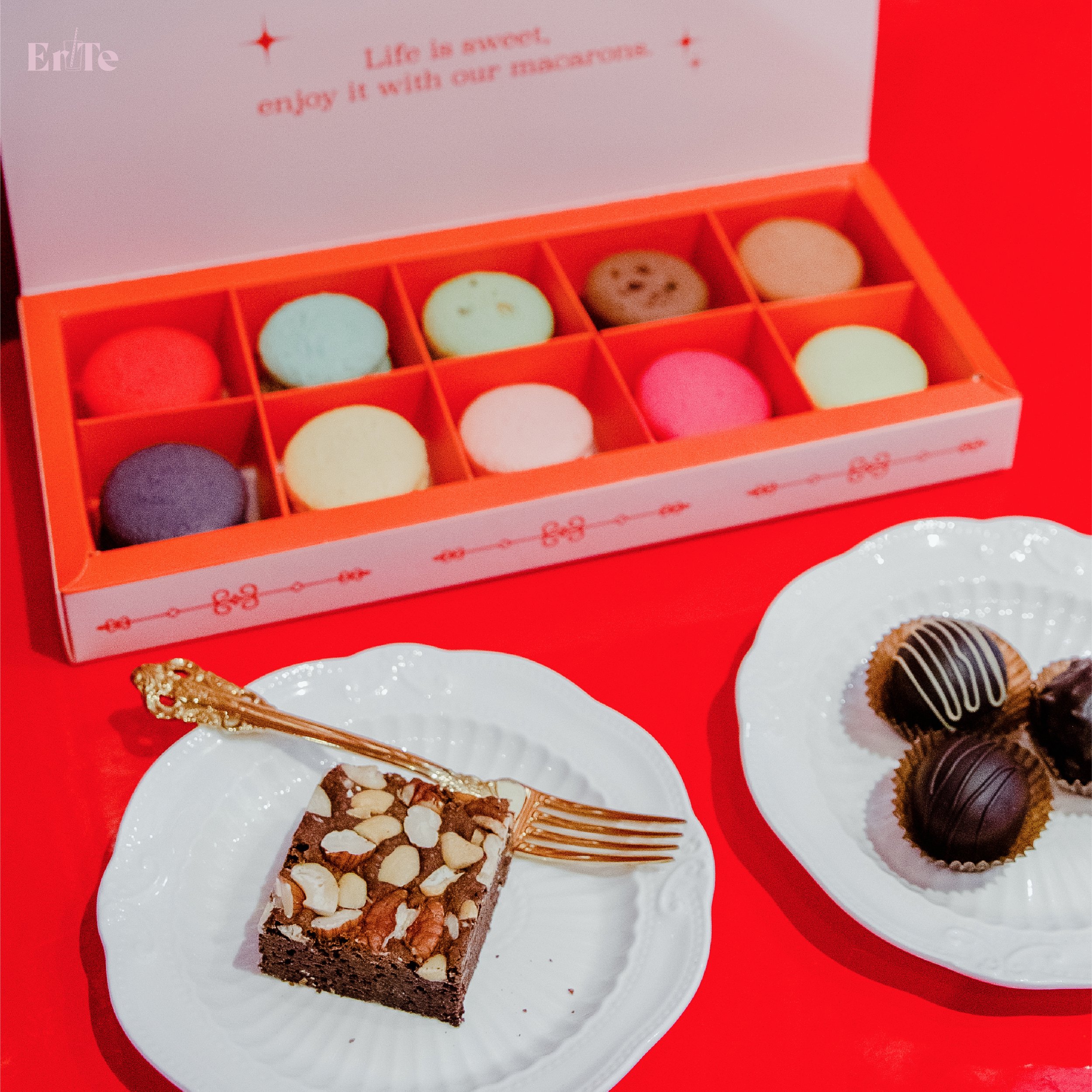
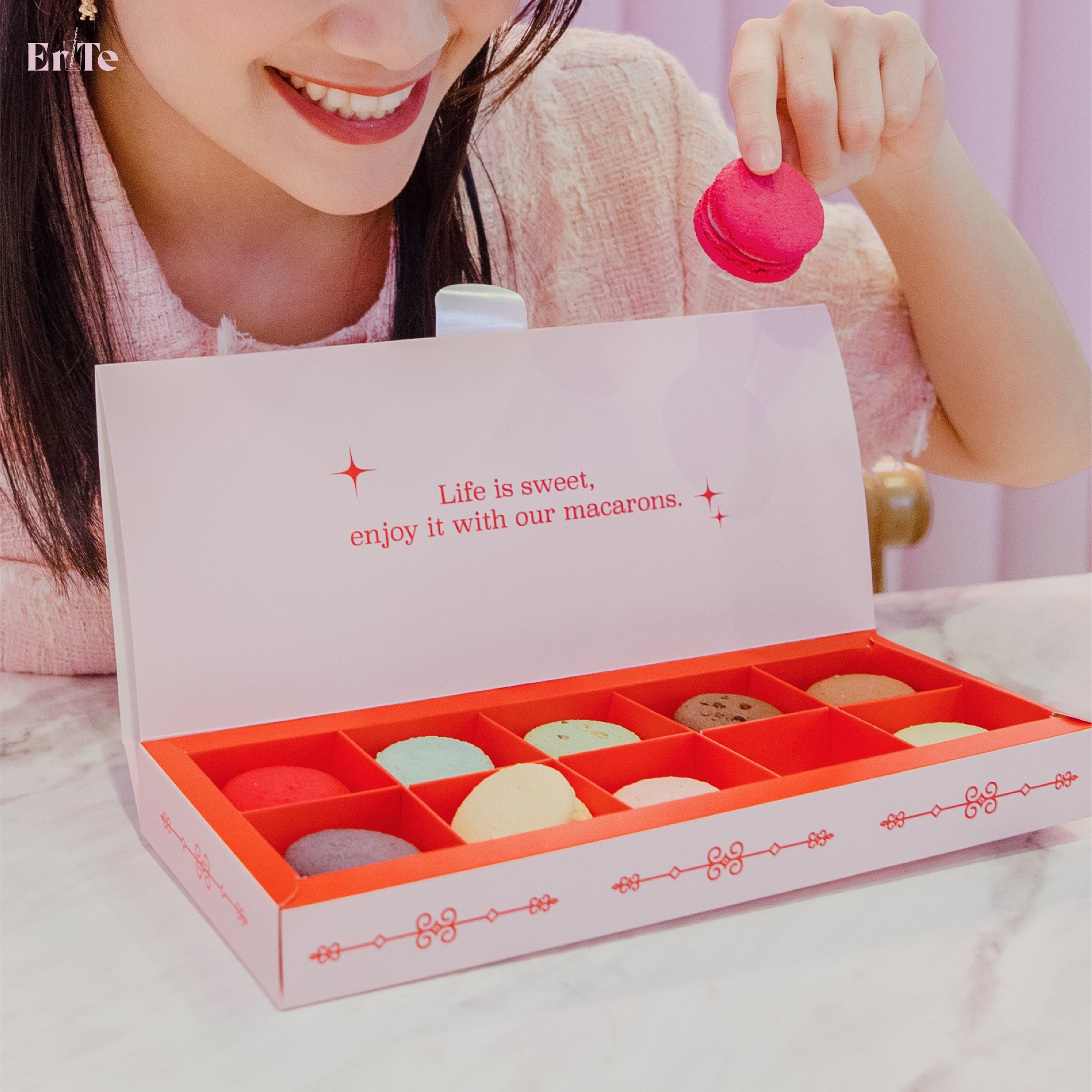
Complementing the logo and color scheme, we have also designed packaging, interior guidelines, and promotional materials, such as a special Valentine's Day sticker, to strengthen the brand's presence and messaging.
Brand Online Presence
Our comprehensive approach to the Er-Te branding project extended to the brand's online presence, prioritizing high-quality photography of their drinks, brownies, and snacks. We created an engaging digital platform to inform customers about promotions and updates, establishing a strong connection between the brand and its target audience. By combining captivating imagery and a cohesive visual identity, we've effectively crafted an online presence that resonates with Er-Te's demographic and enhances the overall brand impact.
With the successful development of a strong brand identity, Er-Te has expanded its business, now boasting three thriving locations. The cohesive and engaging visual language, combined with an effective online presence, has allowed the brand to resonate with its target audience and facilitate its growth.
