Mr. Shake, the first boba tea store in Thailand, serving quality drinks at a reasonable price. With over 30 shops, mostly in high traffic area at every corner of Bangkok. The goal has always been making the best quality drinks for our customers to enjoy, from 1999 until today.
Mr. Shake never stop inventing new menu for our lovely customers. Nobody understands the need of refreshments like we do.“The Revolution of Refreshment”
Logo identity designed for a Japanese restaurant located in Beijing.
Creating all 2018 new still and motion graphics for Janesoraya, a Bangkok based youtuber/blogger with over 170k followers on her channel.
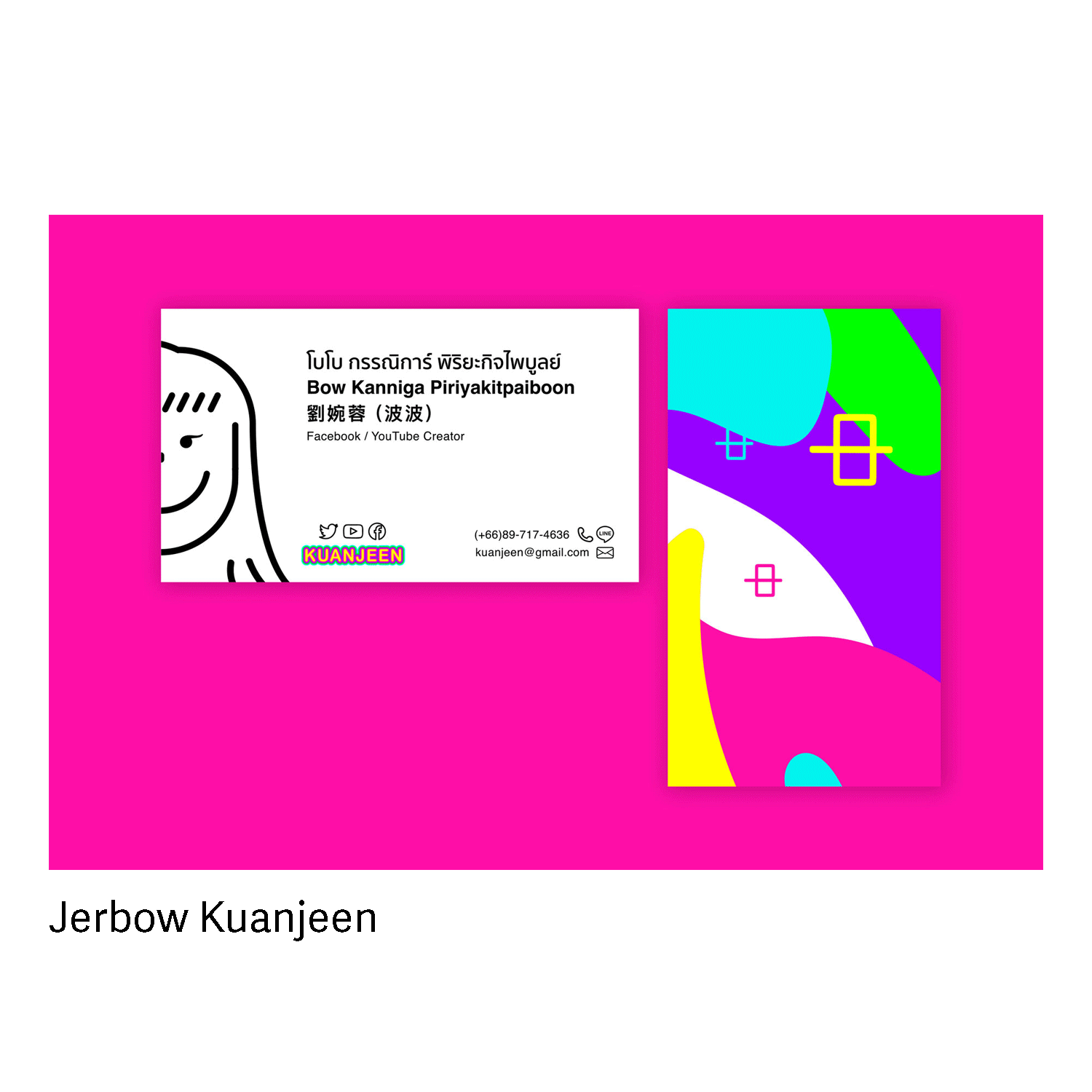
Question: Where does KUANJEEN “hit” the consumer?
Answer: สนุก ว๊าว
An informational diagram on the most essential camera functions for a digital camera, Canon EOS 5D.
Our friend came to us with a goal, her goal is "to become a source of inspiration focusing on young audiences who love to taking photo and explore the world." From then we came up with a name tryXonce, meaning you gotta try something once in your life time, whether it being a city, food, or art and design.
Expanding to the branding for tryXonce, would be better if you can see it yourself. **visit www.tryXonce.com for the full experience.**
Parisa Bunnag is launching her very own platform sharing her interests in fashion and writing. Congratulation in getting attention to write for The Momentum. Thank you for letting us be part of your journey!!
-----
"moreBABEmore started out with a page that serves as a collection of things she found lovely whether it be a cute online shop or a nice cafe. Eventually, it hosted a collection of outfits she wore under #babewearsplus where to find them. She wanted to share all the lovely finds that she can’t get enough of. The name moreBABEmore is calling her out to give us more of what she thinks is such babes."
-----
Take a visit to her site at www.moreBABEmore.com
This is a public installation that was inspired by how people define happiness differently, 人們的幸福定義是不同的. The work gathers 16 different languages that describe happiness, and that are designed as a text mural in the student public space.
Each issue of Glance delivers the latest news about the college; notable achievements of students, faculty, and alumni; recent activities of the CCA Wattis Institute for Contemporary Arts; and special content just for alumni. Feature stories highlight the exciting ways in which CCA is engaging with the community and the world.
History of letterpress: When Type Kisses Paper is a living example of both the invention as well as its usage today. The mix usage of wooden letterpress and digital printed text represents the combination of traditional and modern style of book design. Using the technique, hand-stitched spine and blind-deboss stamped title provides another layer of sophistication, adorned with a thin band of woodblock type.
Featured in Fonts In Use
A poster for an exhibition of lost photographs that have been found after tsunami in Eastern Japan, March 2011. Photos of the nondescript sky represent the sad feelings of lost memories that can never be restored. The poster reflects the damage caused by the chemicals washed over the photographs. The typography sits on the clouds and is collected together like lost family photos.
A work under Agency:Collective, all work byYSR.
From JaneMakeup to JaneSoraya, We worked with our close friend Jane Wongsatayanon, the famous beauty blogger based in Bangkok.
Establishing her new identity from website look and feel to content organizing, nothing is more satisfying than to see her expand her business from only makeup to beauty, fashion, and lifestyle.
View more of at www.JANESORAYA.com
Based on the 2013 minimum wage statistics we are going to examine the relationship between minimum wage and the cost of living in the United State. We are using this data to argue in favor of living wage laws. (that the minimum wage should correspond with living wage)
Voice over by Aaron Sisneros
An ever-growing project, exploring social media and bringing it to life. Through using Instagram API, the work gathers images of the sky from people all around the world by letting them hashtag #whattheskylookslike. This is inspired by the quote “We look up to the same sky, and see such different things.” View all images at www.whattheskylookslike.com
Made with Instagram API, JavaScript, HTML 5 and CSS.
The background of the website changes colors depending on the time of the day–just like the sunrise and set.
*Installation in progress
This system of icons pays attention to the standards and paradigms people are comfortable with and provides an internally consistent experience.
Client: Ford
A work under Agency:Collective
Typography and photography are combined using techniques that render type in abstract forms yet readable as type.
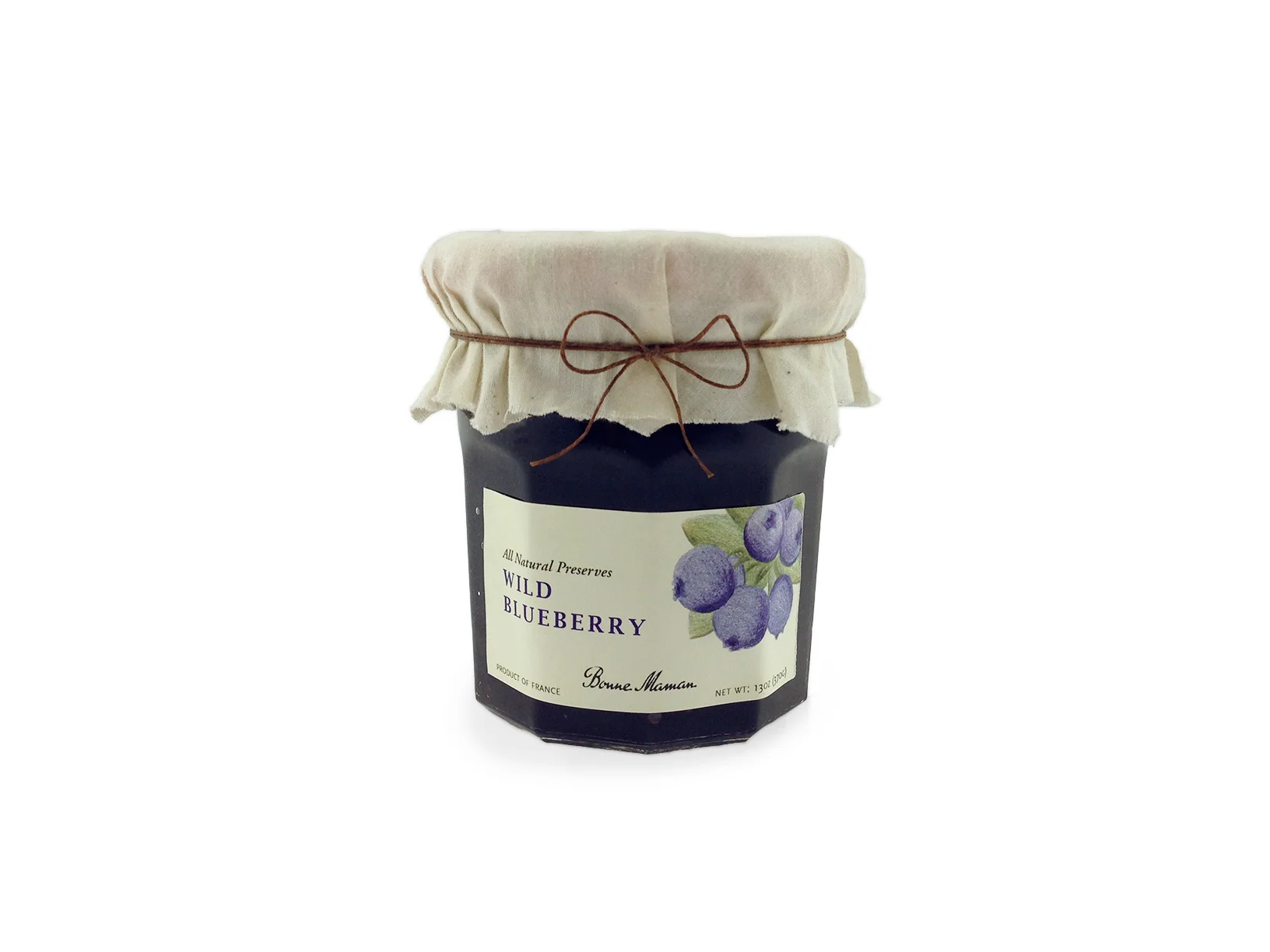
Redesign packaging for Bonne Maman Wild Blueberry Jam, grandma's homemade organic jam.
Illustration by Rachel Hsiao
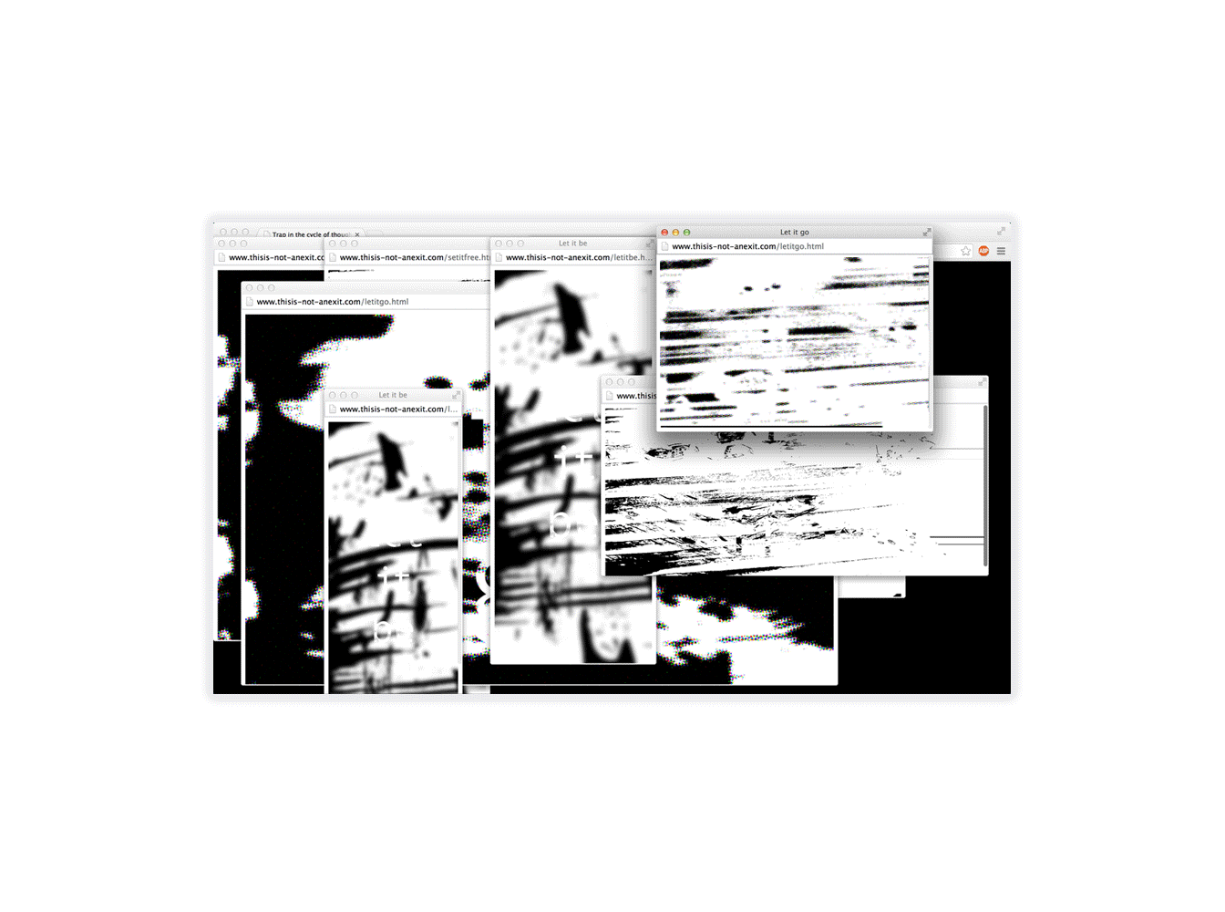
Pushing the boundaries of technology-- creating an experience of one's feelings, which is getting trap in the cycle of thoughts.
Branding for THE NEW LOOK, California College of the Art's 2014 New Student Exhibition. Applications included a series of posters and mugs.
Works that never been produced
Pack of logos and marks.
We go together like cupcakes and beer. An identity and branding project for an imaginary cupcake and beer food truck. Sweet Intoxication is a place where cupcakes and beer unite. It is a fun treat for any party.